Driftwood is a talk I gave at
Playark 2013. It was meant to be a talk about leftovers (the theme of the conference being 'reclaim'), and about
Hello Lamp Post. In the writing, it turned into a broader overview of my own work – on six years of projects around cities and play. I was quite pleased with how it turned out, and wanted to share it on the web. (This is a roughly edited version of the script I spoke from).
<p>
  <a href="https://vimeo.com/85435067">A video recording of the talk is also available.</a>
</p></p>

<div class="notes">
  <p>
    One of the slogans of the Situationist International was:
  </p>

  <p>
    <em>sous les pavés, la plage:</em> "<em>underneath the paving slabs, the beach.</em>"
  </p>

  <p>
    I tend to read that as meaning something along the lines of: underneath formal infrastructure – that dictates "how to be" – is a space to be free, to play, to be unfettered. The beach is an inherently social place; a place shaped by the people on it, rather than by what it dictates they do. The institutions we erect, for good or ill, sit atop a freer environment.
  </p>

  <p>
    There's a lot of meaning bound up in this; it speaks to lots of things that I think are true, especially when it comes to designing toys, games, and experiences in the urban environment.
  </p></p>
</div>

<div class="notes">
  <p>
    I jokingly referred to a toy I was building as <em>situationist software</em> a few months ago. But now that I've had time to think about this more, situationism turns out to be a useful lens to look with. (Though, it should be noted: I am using it as a lens, not entirely literally. It contains useful ideas, but I'm definitely not embracing its entire political stance – and it is, at its heart, a political and revolutionary framework. So, you know, hoping Guy Debord won't smite me from beyond the grave.)
  </p>

  <p>
    Today, I'm going to draw a line through various games and toys I've built that exist within cities, looking at how they sit atop and alongside other structures or experiences.
  </p></p>
</div>

<div class="notes">
  <p>
    Everything I'll show you has something in common. They're all built out of leftovers: leftover information, leftover infrastructure, old technology, open platforms – the driftwood that washes up on the beach of the city, and that allows us to build new experiences. I'm going to look at what driftwood – the materials we can build from – is, and how some of the ideas propounded by the Situationists help us understand the work of creating experiences for people in cities.
  </p>

  <p>
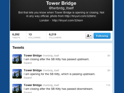
    The first digital toy I made that expressed some ideas about the urban environment was this: <a href="http://twitter.com/twrbrdg_itself">the Tower Bridge twitterbot.</a>
  </p></p>
</div>

<div class="notes">
  <p>
    I wrote this in 2008 when I worked right by Tower Bridge in London.
  </p>

  <p>
    It's really simple: it's a little bot on Twitter; it lets you know when the bridge is opening and closing, and for what vessel.
  </p>

  <p>
    It is what you might call barely-software. It's somebody else's data: all the lift times are published weeks in advance online. I just scrape the page with that data on. It's somebody else's platform – I'm just pushing text to Twitter via the API. It relies on several other people's libraries to work. It's primarily leftovers; I've written about 70 lines of code that glues it all together, and runs once a minute on a server.
  </p>

  <p>
    Like a lot of my work, I characterise it as a toy: a small thing that expresses one idea; partly entertainment, but not entirely so; functional, but as a byproduct of its behaviour (after all, all this information was readily available before I built this).
  </p>

  <p>
    But in building it – as is so often the case when you sit down to make something – it began to reveal several interesting truths.
  </p>

  <p>
    For starters: it's a deliberate decision to make it speak in the first person – <em>I am opening for the MV Dixie Queen, which is passing downstream.</em> Why? Because that's what you do on Twitter: you answer the question "<em>What are you doing?</em>" We all speak in first person on it; so should smart devices or buildings. Once it began speaking like us, it illustrated clearly – to me – how Twitter could be a messaging bus for more than just people, but for all the things and platforms in my life.
  </p>

  <p>
    By placing it into the same context as friends and other services, the Bridge told me more than just about its functionality. It became a heartbeat for the city, showing me how often it opened and closed, letting me imagine how often people sat in queues on it, or waited patiently at the large blue gate on the footpath. Even when I couldn't see it, it reminded me how the city I lived in worked.
  </p>

  <p>
    And as a result, not just for me, but for my friends, it became curiously evocative – not just a functional tool, but a powerfully emotive one too. When visiting family, or overseas, it reminds me that London is still there, still ticking away with mechanical precision. This little piece of software had become synecdoche for the whole city.
  </p></p>
</div>

<div class="notes">
  <p>
    It taps into what situationist Guy Debord described as <strong>psychogeography</strong>
  </p>

  <blockquote>
    <p>
      The study of the precise laws and specific effects of the geographical environment, consciously organised or not, on the emotions and behaviour of individuals.
    </p>
  </blockquote>

  <p>
    Or, more plainly: the relationship between "place" and our understanding of the world.
  </p>

  <p>
    I have two small toys I've built in the past couple of years that are more explicitly and deliberately psychogeographic.
  </p></p>
</div>

<div class="notes">
  <p>
    <a href="http://infovore.org/archives/2012/07/30/ghostcar/">I wrote <em>Ghostcar</em> in 2012.</a> It's a toy I made in part to see how viscerally I'd react to encountering myself on Foursquare.
  </p></p>
</div>

<div class="notes">
  <p>
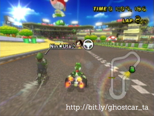
    It's like the ghost car in a racing game that shows you a high score – like in Mario Kart or Ridge Racer: an invisible car that represents the fastest time on the track.
  </p></p>
</div>

<div class="notes">
  <p>
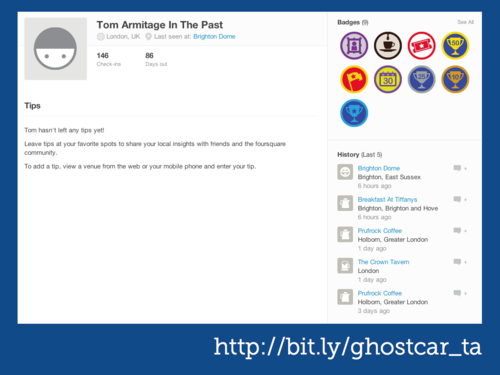
    By contrast, Ghostcar takes me checkins from precisely a year ago on Foursquare and echoes them onto a second, secret Foursquare account. My account is called <em>Tom Armitage In The Past</em>.
  </p>

  <p>
    What this means is: I can check into a location and find myself, a year ago, standing there too. Does that make sense?
  </p>

  <p>
    (The terms and conditions say I can't imitate other people, but that doesn't stop me imitating myself, right?)
  </p>

  <p>
    So there's me in the present, and also me-a-year-ago brought forward into the present.
  </p>

  <p>
    What I learned from this is: you can very viscerally remember a year ago. I see old-me somewhere, and remember who I was in that pub with, or why I was at an event, or what terrible film I saw, or how sad – or happy – I was at any particular point in time.
  </p>

  <p>
    It reminds me of how I'm attached to places; what my routines look like. And it's much more visceral to see it on a map – on the same platform I entered this data into – than to just get an email about it.
  </p>

  <p>
    Again, it's all made of leftovers – leftover data, that I spat into the world a year ago. (And: I started using Foursquare properly around the same time I built this, in order to fill it with good data). Somebody else's platform. Somebody else's libraries. ghostcar itself is, other than admin interface to set it up, fundamentally invisible. And once it's running, you never touch it again: it'll continue working forever.
  </p></p>
</div>

<div class="notes">
  <p>
    And that model – virtual copies of myself used to explore weird behaviours – continues to fascinate me. So I'm making a follow-up. I've just kicked it off recently, so consider this the first time it's ever been shown.
  </p>

  <p>
    My new derivative of this is called <em>ghostme</em>. Ghostcar displaced me in time – a year. Ghostme displaces me in <em>space</em>. It makes a copy of me that inhabits another city, and goes where I might go were I alive there.
  </p>

  <p>
    Let me explain it more clearly. Once again, this is a Foursquare echo machine – we're taking the checkins from one account, and then reflecting them on another. Only this time we're being less literal.
  </p></p>
</div>

<div class="notes">
  <p>
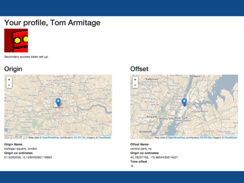
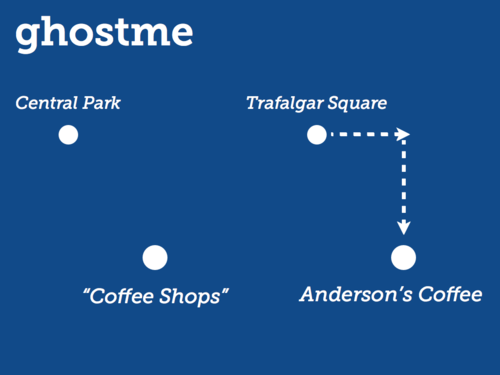
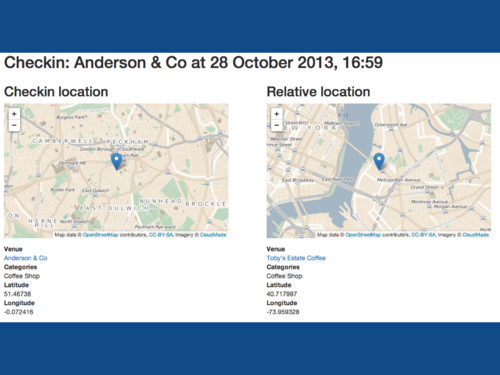
    When I set up Ghostme, I tell it what I think the "centre" of my existence is. I've chosen Trafalgar Square in London. I also tell it what I think the centre of my copy's existence is; in this case, Central Park in New York.
  </p></p>
</div>

<div class="notes">
  <p>
    Then, every time I check in on Foursquare, the software calculates that checkin's position as an offset from my centre; applies that offset to the centre of New York; and, most crucially, then looks for all the venues in NY by that location <em>in the same category on Foursquare</em>.
  </p></p>
</div>

<div class="notes">
  <p>
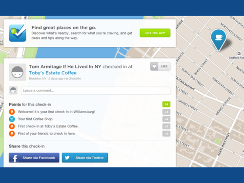
    So, in this case, it takes a rather nice Peckham coffee shop, and looks for a coffee shop reasonably south and east of Central Park, and finds Toby's Estate in Williamsburg. Which is a coffee shop I rather like.
  </p></p>
</div>

<div class="notes">
  <p>
    And, five hours from now – because of the time difference – ghost me goes and checks in there.
  </p></p>
</div>

<div class="notes">
  <p>
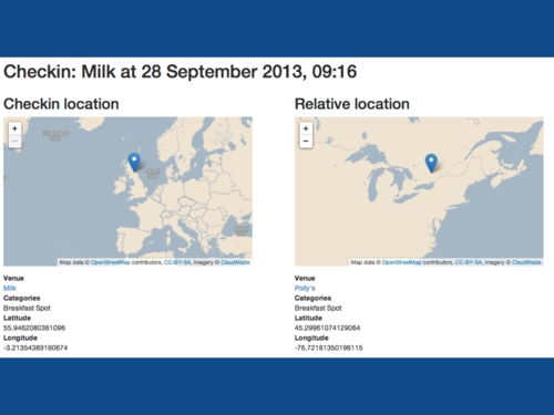
    I wrote and tested a lot of this in a café in Edinburgh. I kept finding parallel checkins in Ontario, which I thought was some awful bug, until I looked at a map and realised no, if you go as far north from NY as Edinburgh is from London, you get to Canada.
  </p>

  <p>
    It teaches you a lot about relative space, for starters; it also has weirder connotations, because it's less directly in your control – but when, in the case of Toby's Estate, my ghost copy goes to a place I've also been to – and that I love – it makes you grin; it's like affection for a pet or a child.
  </p>

  <p>
    It also shows you how different the population densities and shapes of cities are – NY is, broadly speaking, quite long, especially if you consider Central Park the middle (which, given the size of Brooklyn, it really isn't). And: it reminds me how much I like that city, and how much I love the one I currently live in.
  </p>

  <p>
    It's not been live long – and still needs polishing before I can let anyone, even friends, use it – but it's having the psychogeographic punch I wanted it to have.
  </p></p>
</div>

<div class="notes">
  <p>
    I can't talk about Psychogeography and the Situationists without talking about <em>dérive</em> – "Drift" – Debord's process for experiencing the psychogeographic procedure.
  </p>

  <p>
    Put simply: <em>dérive</em> is an unplanned journey through the city, allowing oneself to be directed by the architecture and environment. The goal is to experience something entirely new – to expose yourself to <em>situations</em>. It is not so much getting lost as simply walking with no particular plan and being shaped by the way the environment impacts your unconscious.
  </p>

  <p>
    Debord would point out that it was necessary to set aside both work and leisure in order to dérive successfully – to commit wholly to the task. That is a somewhat indulgent process, I'll warrant – but I reckon it still has value at a smaller, less total scale than Debord advocated.
  </p>

  <p>
    An earlier project sought to alter and shift participants' relationships with the city they lived in.
  </p></p>
</div>

<div class="notes">
  <p>
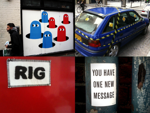
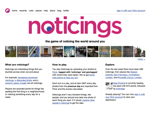
    My friend Tom Taylor and I, in about 2009, noticed a lot of our friends taking similar sort of photographs on Flickr – tiny things they'd noticed in the world, not sure if anyone else had seen it, captured for posterity.
  </p>

  <p>
    We liked that behaviour, and, more importantly, wanted to see more of it – wanted more people to look at the world like this.. So we built this tiny, almost-game, called <a href="http://noticin.gs">Noticings</a>.
  </p></p>
</div>

<div class="notes">
  <p>
    We explained it at the time thus:
  </p>

  <blockquote>
    <p>
      Noticings is a game you play by going a bit slower, and having a look around you. It doesn't require you change your behaviour significantly, or interrupt your routine: you just take photographs of things that you think are interesting, or things you see. You'll get points for just noticing things, and you might get bonuses for interesting coincidences.
    </p>
  </blockquote>

  <p>
    Players played simply by telling the site they were playing, and tagging photos on Flickr as "noticings".
  </p>

  <p>
    When it launched, there was one rule: you get ten points for taking a picture. Each day, we'd score the previous day's photos. And as time went on, we added new rules:
  </p>

  <ul>
    <li>
      being the first person to take a picture in a neighbourhood
    </li>
    <li>
      your first picture in a neighbourhood</pli> <li>
        taking a picture of a typo
      </li>
      <li>
        taking a picture of something red
      </li>
      <li>
        taking a picture near where another picture was taken
      </li>
      <li>
        taking a picture every lunchtime for a week
      </li></ul></div> </div>
      <div class="slide">
        <img class="slide-image" src="/talks/driftwood/img/driftwood.019.png" /></p>

        <div class="notes">
          <p>
            And so on. It was a bit like Foursquare: some of the rules were secret, some not, and they emerged over time. Some ran for a short period of time. Here's a noticing that got points for being a noticing – and also for being something "lost" – an arbitrary judgment the player can make with a tag.
          </p></p>
        </div>
      </div>

      <div class="slide">
        <img class="slide-image" src="/talks/driftwood/img/driftwood.020.png" /></p>

        <div class="notes">
          <p>
            And here's a neighbourhood, where you could see noticings within a place. Note how the scores are calculated here.
          </p>

          <p>
            Noticings was played simply by posting picture to Flickr – it used their service, leftover data from players' photographs. It also used leftover <em>time</em> – fitting into players' routines, barely changing what they do – for some players, just asking them to use one new tag, and that's it. But it also then could encourage new behaviour, through new rules, through new bonuses – or simply because they'd enjoyed each others' pictures.
          </p></p>
        </div>
      </div>

      <div class="slide">
        <img class="slide-image" src="/talks/driftwood/img/driftwood.021.png" /></p>

        <div class="notes">
          <p>
            It also cultivated a tiny bit of dérive in the day – not wholehearted commitment, like Debord wanted; but just enough – drifting off in the middle of daily routine. Or changing routine, making pilgrimages, just in order to participate, like this player.
          </p>

          <p>
            It's exciting and weird that we changed people's behaviour like this.
          </p></p>
        </div>
      </div>

      <div class="slide">
        <img class="slide-image" src="/talks/driftwood/img/driftwood.022.png" /></p>

        <div class="notes">
          <p>
            Noticings closed about 15 months later. We didn't have time to make it better, and had both just got new jobs. We closed the game.
          </p>

          <p>
            But: people still use the noticings tag; our friends use it as a way of describing particular kind of looking. There's a little, lasting impact. And this was pre-Instagram.
          </p>

          <p>
            Yes, for many people, Instagram is a social camera, but look at how some people use it as this tiny little social Martin-Parr-app. Lots of people are noticing, even without our little game. What was most important was that people performed the act – not that they got points for it. The fact they still are, in different ways, makes me happy.
          </p></p>
        </div>
      </div>

      <div class="slide">
        <img class="slide-image" src="/talks/driftwood/img/driftwood.023.png" /></p>

        <div class="notes">
          <p>
            It's interesting for me to look back on this body of work when considering the final – and perhaps largest – project I'd like to talk about today. It takes a lot of these impulses – the psychogeographic; the act of creating situations; the act of dérive; the use of leftovers; the barely-game – and pieces them together to create a new kind of interaction that played out in the city.
          </p></p>
        </div>
      </div>

      <div class="slide">
        <img class="slide-image" src="/talks/driftwood/img/driftwood.024.png" /></p>

        <div class="notes">
          <p>
            <a href="http://hellolamppost.co.uk">Hello Lamp Post</a> was a project I built along with PAN Studio and Gyorgy Galik. We entered it as a pitch for <a href="http://www.watershed.co.uk/playablecity/">the inaugural Playable City competition,</a> organised by Watershed, the Bristol arts organisation – and we won. It ran this summer for two months, and, as I look back, touches on all these ideas I've mentioned so far. Let me go in to a bit more detail.
          </p></p>
        </div>
      </div>

      <div class="slide">
        <img class="slide-image" src="/talks/driftwood/img/driftwood.025.png" /></p>

        <div class="notes">
          <p>
            Watershed defined a Playable City as:
          </p>

          <blockquote>
            <p>
              "…a city where people, hospitality and openness are key, enabling its residents and visitors to reconfigure and rewrite its services, places and stories. It is a place where there is permission to be playful in public."
            </p>
          </blockquote>

          <p>
            It's a city built on the beach, not the paving stones. This is human, playful, gentle; very much the opposite of ideals about clarity, accuracy, integration, efficiency and refinement – all ideals that emerge in the prevailing rhetoric around "Smart Cities".
          </p>

          <p>
            Worth noting, too, that the Situationists were in part resistant of the Planned City – Haussman's rearchitecting of Paris in the 19th century was very much a top-down plan. He planted fully grown trees onto Boulevard Haussman rather than letting them grow – so that everything would fit the plan. But cities are made of people, and people cannot be planned; cities require space to be organic and grow. Another harking back to the situationists.
          </p></p>
        </div>
      </div>

      <div class="slide">
        <img class="slide-image" src="/talks/driftwood/img/driftwood.026.png" /></p>

        <div class="notes">
          <p>
            Anyhow. Hello Lamp Post. When we were developing ideas, a core theme kept emerging – memory and its relationship with location. We kept coming back to the idea of the city as a physical diary, based on the way that returning to places could help trigger memories. We wanted other people to see the city in this way, and be encouraged to share their past experiences and stories with each other. Making psychogeography a little more visible.
          </p>

          <p>
            And we wanted to do that in as accessible a way as possible: for the most people, at the largest scale. I've worked around ARG-like things before, and to be honest: it's not that hard to create a cool experience for a few hundred people that's not very good value for money. Making something fun and immediate for thousands – that's far harder. But if we were to make the city playable, it had to be at the biggest scale possible.
          </p>

          <p>
            Firstly, that meant making it super-accessible. An app for a smartphone might be cool and have GPS and that, but it limits your audience. Everybody understands SMS – <em>every</em> mobile phone has SMS – and it's super-simple to implement now; <a href="http://twilio.com">Twilio</a> does the legwork for us. Superficially unexciting technology made super-simple by web-based services.
          </p></p>
        </div>
      </div>

      <div class="slide">
        <img class="slide-image" src="/talks/driftwood/img/driftwood.027.png" /></p>

        <div class="notes">
          <p>
            And secondly, to use as much of the city as possible without incurring too many costs – we'd need to use things that were already there. We wanted instead to find a way of hijacking the existing infrastructure – we spent a lot of time scouring the city for opportunities. We noticed that a lot of street furniture – lampposts, postboxes, bus stops, cranes, bridges – have unique reference/ maintenance labels. We thought it would be interesting for these objects to be intervention points – something more tangible than GPS and quite commonplace. Just telling us where you are.
          </p>

          <p>
            At the time, I jokingly said that the Smart City uses technology and systems to work out what its citizens are doing, and the Playable City would just ask you how you are.
          </p>

          <p>
            What we ended up with was a playful experience where you could text message street furniture, hold a dialogue with it, and find out what other people had been saying.
          </p></p>
        </div>
      </div>

      <div class="slide">
        <img class="slide-image" src="/talks/driftwood/img/driftwood.029.png" /></p>

        <div class="notes">
          <p>
            This is what a conversation looks like.
          </p>

          <p>
            We heavily "front-loaded" the experience – the first experience of Hello Lamp Post has to be <em>really good</em>. It's no good putting all the best content behind hours of play – most of it won't get seen, as a result. So we chose to make the early interactions completely fully-featured – and then treat the players who continued to engage, to come back again and again, to more subtle shifts in behaviour that were still rewarding – but that didn't hide most of the functionality from casual players. The Playable City had to be playable by everyone.
          </p>

          <p>
            If a player played more, the game changes with them. The first time someone interacted with an object would be a bit small-talky – questions about the surroundings. But on return visits the object would appear to remember the player and ask progressively more personal questions – about their memories and points of view. The intensity grew as familiarity grew – and provided incentive to continue talking to objects.
          </p>

          <p>
            We were building a little <em>situation</em> – creating a ritual, about talking to street furniture. A friend would tell me every time he saw somebody get out their phone and clearly start texting an object; it made me happy that we'd create this new, strange little interaction.
          </p></p>
        </div>
      </div>

      <div class="slide">
        <img class="slide-image" src="/talks/driftwood/img/driftwood.030.png" /></p>

        <div class="notes">
          <p>
            To induct people into the idea, though, we needed to make it legible – it's a fundamentally invisible system otherwise. Watershed helped us with the physical advertising campaign. These were our hero objects: all these banners told you how to talk to whatever they were on, giving you the entire instructions on the poster. "<strong>Text hello banner #code to number</strong>". It was super-satisfying that the posters could all be the entire user manual for the game: you just do what they said, and off you go.
          </p>

          <p>
            The majority of players interacted with these objects first – but many would then go on to play with other objects in the city, once they'd understood it. It helped give the invisible system form.
          </p></p>
        </div>
      </div>

      <div class="slide">
        <img class="slide-image" src="/talks/driftwood/img/driftwood.031.png" /></p>

        <div class="notes">
          <p>
            We had just under 4000 players over the two month run, who collectively engaged in over 9500 conversations -speaking with over 1000 unique objects and ultimately sending 25000 messages our way.
          </p>

          <p>
            You can see the distribution of conversations – the eponymous lampposts received a lot of attention, but so did the clearly labelled post-boxes and some of Bristols icons – such as Pero's Bridge and the cranes in the old harbour district.
          </p>

          <p>
            Also, Gromit – from Wallace & Gromit got quite a few mentions – there were 80 giant Gromit statues all over Bristol during the summer, and people took it upon themselves to start talking to these too. Even though, you know, Gromit never says anything.
          </p></p>
        </div>
      </div>

      <div class="slide">
        <img class="slide-image" src="/talks/driftwood/img/driftwood.032.png" /></p>

        <div class="notes">
          <p>
            But what was most exciting was exactly *what* people were saying; what they were sharing about their particular Bristol with others; what those moments of ritual were creating. From the poetic to the local, and the personal . And of course, because of the way the game worked, other people answering questions would see these via their phones.
          </p>

          <p>
            And of course, the apt questions for particular objects led to particularly great answers.
          </p></p>
        </div>
      </div>

      <div class="slide">
        <img class="slide-image" src="/talks/driftwood/img/driftwood.033.png" /></p>

        <div class="notes">
          <p>
            As people played, we displayed their quotations – moderated, of course – on the project website. What was great was to see just how people were engaging with the city: the kind quotations we were getting from the get go was exactly what we hoped people would say.
          </p>

          <p>
            Now that I look back on it, I can see that Hello Lamp Post acts as a lovely summation of five years of toys and games built around cities. It's an experience that doesn't so much interrupt your experience of the city as it <em>layers on top of it</em>, letting you see the paving and the beach all at once. It builds ritual and new interactions into routine. It requires almost nothing to engage with it – and most of the systems it uses – SMS, Twilio, the city – are already built by other people. We just built the middle layer. (Which, in this case, is rather complex. But you get the picture.)
          </p>

          <p>
            What can we learn from all this?
          </p></p>
        </div>
      </div>

      <div class="slide">
        <img class="slide-image" src="/talks/driftwood/img/driftwood.034.png" /></p>

        <div class="notes">
          <p>
            By building on top of other services, we also create a kind of sustainability. When Noticings closed, the photos were still on Flickr – just with an unusual tag. If the ghostbots break, their activity is still preserved forever.
          </p>

          <p>
            We don't destroy the value we've created the second we turn it off. Which is more like how a city behaves: it degrades, or is reused, or gentrified, but history becomes another layer of patina on top of it – it isn't torn down instantly.
          </p>

          <p>
            We're not planting fully grown trees and then tearing them out: we're building an ecosystem, and perhaps other games or tools will build on top of <em>us</em>. We hoped – once people twigged how Hello Lamp Post worked – they might start drawing codes on things, on posters, on street art, in order to attach messages to it.
          </p></p>
        </div>
      </div>

      <div class="slide">
        <img class="slide-image" src="/talks/driftwood/img/driftwood.035.png" /></p>

        <div class="notes">
          <p>
            If the city is a beach, it is littered in driftwood. When I think of driftwood, I think about flotsam and jetsam. Flotsam is that which floats ashore of its own accord; jetsam is that which is deliberately thrown overboard from a boat – man-made detritus, as opposed to natural wastage (or wreckage).
          </p>

          <p>
            I think those two categories also apply to the materials I'm terming "driftwood" today. And I genuinely believe the things I'm about to describe are materials, just like wood or steel. That might be obvious with regards to some of these – but not all. If a material is something we manipulate and shape as designers, then all these things could be considered materials.
          </p></p>
        </div>
      </div>

      <div class="slide">
        <img class="slide-image" src="/talks/driftwood/img/driftwood.036.png" /></p>

        <div class="notes">
          <p>
            Leftover infrastructures – services like Twitter and Foursquare, more tactile infrastructure like transit networks or maintenance codes on objects. And leftover technologies, too; print-on-demand, SMS, telephony – all are now available over straightforward web APIs. These things have become commoditised and tossed overboard, made available to all.
          </p>

          <p>
            In this way, we can spend our time working on unique experiences and interactions, rather than the underlying platforms.
          </p></p>
        </div>
      </div>

      <div class="slide">
        <img class="slide-image" src="/talks/driftwood/img/driftwood.037.png" /></p>

        <div class="notes">
          If that's our jetsam, what's the flotsam – the stuff just floating around?</p>

          <p>
            <b>Data</b>
          </p>

          <p>
            The city is drowning in data.
          </p>

          <p>
            I tend to describe data as an exhaust: you give it off whether you like it or not, and it follows you around like a cloud. People give it off; machines give it off; systems give it off. Given all the data we emit by choice – our locations stored in Foursquare, or Twitter, or Facebook; our event attendance tracked by Lanyrd and Eventbrite; as well as that we emit regardless of whether we want to – discount card usage; travelcard usage; online purchasing data – well, what are the experienes you could build around that? This is all there (with end-users permission) for the taking, and it can lead to unusual new ambient interactions.
          </p>

          <p>
            <strong>Environments</strong>
          </p>

          <p>
            What are the environments you can repurpose? Not just the City as a whole but smaller spaces – institutions, establishments, public spaces, parks, transit networks. All these are spaces and contexts to build within, and they all come with their own affordances. Even when they're controlled or marshalled by others, they are spaces to consider reclaiming and repurposing.
          </p>

          <p>
            <strong>Routine</strong>
          </p>

          <p>
            And just as we can reclaim space, consider Time as a material to be reclaimed to: what are the points of the day we can design for – not just active, 100% concentration, but all the elements where there is surplus attention? We can't create Debord's focused, committed dérive – but how can we create a tiny fragment of it, without invading the daily routines we all have to live with?
          </p></p>
        </div>
      </div>

      <div class="slide">
        <img class="slide-image" src="/talks/driftwood/img/driftwood.038.png" /></p>

        <div class="notes">
          <p>
            Because ultimately, this [above] is not the city I know. This is not More London; this is Less London. More London is this big bit of space on the South Bank by city hall, which looks like public space but is, in fact, very much not. You know it's not public because it stops you behaving like it's a city; it is doing everything in its power to resist the beach underneath.
          </p>

          <p>
            I don't think, ultimately, the city <em>can</em> resist the beach it sits upon. There are so many things we can build atop it, be it on semi-public, semi-private, corporate spaces – or the genuine publics of the city.
          </p>

          <p>
            To build and make them, we don't even need to invent architectures and infrastructures – we don't even have to make it obvious they're happening. We can use what's already there –
          </p></p>
        </div>
      </div>

      <div class="slide">
        <img class="slide-image" src="/talks/driftwood/img/driftwood.039.png" /></p>

        <div class="notes">
          <p>
            – making new experiences out of the driftwood that lives in the city and across the network. Lifting up the paving slabs to reveal the beach underneath.
          </p></p>
        </div>
      </div>

      <div class="slide">
        <img class="slide-image" src="/talks/driftwood/img/driftwood.040.png" /></p>

        <div class="notes">
          <p>
            Thanks very much.
          </p></p>
        </div>
      </div></div>
I spent a day in Sheffield this week, for a short piece of design consultancy with Rattle. A really good workshop: some suitably curvy thinking, good sketching, and the result was a somewhat curious piece of media invention: inventing a media format for data visualisation.
A second day in the studio wrote this up with sketches, notes, and animatics. I think it’s gone in an interesting direction, though it’ll be interesting to see how it develops once it’s in the hands of makers: that’s where the meat of this work will be.
On Hello Lamppost – Muncaster – this week, the big news was the launch of the trailer. That’s had a great response, from both friends and the media. My colleagues at PAN sure do know how to make charming, informative short films.
Lots of meaty work on Hello Lamppost, too: defining and designing the final types of interaction, and also working out what we need the website to do. The coming weeks are going to be very busy on that front, burning down to launch, but we’ve got a plan in place: it should turn out well. Ben’s written a great update about everything we’ve been doing over at the Pan blog.
And finally, some communication work – pitching, discussing, scoping – about a project called Sore; bringing the likelihood of it happening closer to the event horizon.
Onwards!
Hello Lamppost launches in just under a month. This is the trailer we shot in Bristol a few weeks ago for the project.
A short week, thanks to a pleasant and much-needed sunny Bank Holiday Monday.
This week involved a bunch of travel. Tuesday was a day in Brighton to discuss a potential art commission, currently referred to as Sore. Lots of interesting thoughts and discussion, but I need to sit down and process it offline a bit. So that’s going to be a focus of early Week 34.
Thursday was a trip to Bristol for the next tests and demonstrations of Hello Lamppost, our Playable City commission.
A secret: I find playtesting painful.
It’s a similar pain – but not identical – to user-testing. If you’ve ever stood on the dark side of a two-way mirror, and watched someone stab with a mouse at a product you’ve designed, failing to achieve a task you were sure was straightforward… you’ll have a glimpse of that pain.
But the element of testing games that I find uniquely painful is what we’re testing for. I’ve watched users fail to complete tasks, which was annoying, because we were designing for utility, for functionality: helping people achieve goals swiftly and simply.
When I test a game, I’m testing to see if it’s fun. Well, and many other things: is it balanced? Is there a skill curve? Would you come back to it? How do experienced and new players work together?
At the bottom of that, though, is a summation of all those questions: is it fun? Did it entertain?
Watching somebody explicitly not have fun with something that’s only purpose is (in one way or another) to entertain – well, that’s more awkward than any transactional website test I’ve done.
So for the duration of playtests, I’m pretty on edge.
First tests are always particularly tough – they should be; they indicate what’s going to need work. I’d be worried if they weren’t. And our first test, a few weeks ago, showed up lots of edges and holes.
Thursday was our second playtest in Bristol, and it was a notable improvement on the first – and satisfying and insightful in its own right. Lots of the rough edges from the first test were sanded away; the new elements of charm were all picked up on; and whilst it may have failed or had obvious holes, they didn’t seem to have the disarming effect of the first test, where players would be jolted out of the experience quite hard.
Also, the 12-year-olds we tested it with definitely enjoyed it, which was a really positive sign. (As was the enthusiasm of the project sponsors, who saw it later that night).
A good day, then: all the work of the previous week, and of some of this, paid off, and we’ve got a much clearer sight of the critical path for the final month. And, slowly, I began to get over my hatred of how playtesting makes me feel.
The week ended with a bit of maintenance work on Concert Club, filing down some rough edges and fixing some bugs that our early users have caught.
Monday and Tuesday were spent in Bristol at the Pervasive Media Studio, running our first playtests of Hello Lamppost. Lots of useful feedback, lots of things to patch up and fix, and excellent support from the extended team at PMS.
The middle of the week saw the final demonstration of Detling to the BBC. That should be launching in a few days – and I’ll share more details of it then. It was a good demo, but also exciting to consider what the prospects beyond the early alpha will be.
There was a short piece of work towards the end of the week – Wilton – with After The Flood. I’ve known Max for a while, but it was good to work with him, even on a tiny engagement. A short period of sketching, thinking, and producing some illustrations of interfaces around data.
And then at the end of the week, I took the talk about data from last week at Telefonica, and showed it to a few people at Decoded. I think it went down well.
Lots of thinking and fixing on Hello Lamppost – and by the end of the week, a plan of attack to build what we hope will be the final platform for it. That’s for week 32, though.
Back to Playable City – Muncaster – this week. I spend a few days with Sam at Pan, really honing down the conversation mechanic and making sure the design supports everything we hoped it would. And then, for the second half of that work, focusing on getting a working implementation for playtests next week.
Conversation-systems – as I have learned many a time, most notably in Havasu – inevitably turn out to be messy tangles of procedural code, so it’s worth working hard to keep the codebase as sane as I can. That tends to involve drawing lots of flowcharts, documenting not only the expected routes through the system, but also the way the software implements those – which for various reasons isn’t always the same. It’s a good, visual way to make sure I don’t get lost in a maze of my own making.
On Wednesday, I went to Telefonica Digital to give a short talk about data visualisation at an internal hackday. That was a good excuse to do some new thinking, and I’m pleased with the new talk that emerged; some useful ideas to continue to think on, and which will no doubt feed into future talks. Thanks to Paul for the invite.
I also spent an afternoon working one final feature into Detling that we all agreed needed to be slotted in; it really closes the loop of the alpha, and makes the potential of the product much more obvious. Nice to drop it in at the last minute with relative ease. We’re showing the project to the BBC next week.
And finally, this week’s freelancer top tip: GOV.UK has ICS files for bank holidays. Thanks to subscribing to that a while back, I remembered to take Monday off. Ice cream and the smell of the sea are a very restorative way to kick the week off.
Week 28: the final week of Detling.
And, I’m pleased to report, not too much of a scramble to the finish line. Instead: a carefully measured burndown, ticking things off the issue list as the team hummed along nicely. It was great to get a day with Dean in the studio, fixing all his snags with my design implementation, and adding a little polish where appropriate. It was also lovely to have another designer passing over a lot of the interactions whilst I finished up implementation – and, it goes without saying, it’s just great being in a room with him. We had a lot of fun.
The team converged nicely for the last two days, and we also fitted in a lot of copy overhaul as well as handover to Caper’s technical director, James; an hour took him through a complete tour of the site, and we had it up and running on his own machine as swiftly as anyone could hope for.
A satisfying end to a tight project, then. We all could see the next steps – the obvious jumping-off points, the rough seams in it – but they’re going to have to wait. For now, we need to put it in front of some real users, and see how they react. Pleasingly, that means it’ll be live in the real world, and I should be able to point to it shortly.
I spent a couple of days this week on the Playable City work with PAN. This was both game design work and some code refactoring: a fairly hefty refactor, but it left the codebase in a much better place for the design’s desires and ambitions, and should be easier to build on. Glad to have that out of the way. Aanand was a big help a few weeks ago in talking some sense into me.
On Friday, I spent the day poking around with my FRDM KL25Z: a prototyping board for the mbed platform. It’s a small prototyping board, about £8, and more powerful than an Arduino (though a tad less friendy to use). On-board, it has a lot of pin-outs, as well as an accelerometer, an RGB LED, and a capacitive touch strip.
I soldered up headers onto both boards, and started poking the mbed environment. One of the projects I’m investigating with it – a MIDI-driven readout – is still going to be harder than I planned, mainly owing to the programming side – but otherwise, got them up and running swiftly. Interesting to diversify into new microcontrollers, and useful learning for the summer. I shall continue to poke it in due course.
A good week. By the end, the combination of project conclusions and some strong antibiotics meant I was pretty wiped. Over the next few weeks, I’m primarily focusing on an equal split of Playable City, along with some of my own work, which will lead to some new things to share here, I hope.
A relatively unremarkable week. A day at PAN, working on Playable City and chatting with Ben and Sam – and the rest of the week spent working on Detling for Caper.
I finished hacking up a prototype for the Playable City chatbot, to expose a few things – how fast the feedback loop was; what SMS affords; what sort of language we need to stick to; how natural it feels to use. Something for Ben and Sam to play with whilst I’m wrapping up Detling. I got there, though there’s a big architectural shift I need to make as soon as possible – something I discovered through the making. (Namely, that my domain model wasn’t quite right. Good to catch this now. When I get back to the project, it’s the first thing on the list.
The Detling work was primarily infrastructural: setting up lots of outbound emails, shifting the sending of email onto a background queue.
This was not that hard at all – partly down to the maturity of the Rails ecosystem in 2013, and partly down to the maturity of service platforms. I’m using Sidekiq on top of Redis as my background queue, and it’s pretty much install-and-go. devise-async moves all the signup mailers onto that queue, and it didn’t take much work in the codebase to move the blocking mailers onto queued tasks. Sidekiq also gives us scheduled tasks for free – ideal for the reminders that the site is going to send out.
Then it was just a case of setting up outbound email. I’m using Postmark for this. I’m a big fan of their service: inbound and outbound email simplified down to POST requests. Best of all, they handle things like whitelisting, meaning I don’t have to worry about my outbound email being blocked. I’m happy to pay the small cost for that.
There’s still a skill to gluing these pieces together appropriately, but it’s the quality of libraries and services like these that let me focus on the domain-specific problems of the project, rather than reinventing the wheel; it lets us get a lot done for relatively little effort, and it’s this approach that’s helped Detling motor along.
Beyond the infrastructure, I spent the rest of the week focusing on unknown unknowns and new edges that were arising: simplifying URLs, refining the ingest process, beginning to integrate Dean’s design work, thinking about editorial content, and working with the team to really line up the burndown for next week – our final full week of build.
And that was it: no meetings, no strategy, just head down at the codeface.
Week 25. Which, indexing from zero, is the 26th week. Which means I’ve been doing this half a year.
I think it’s going alright.
The majority of this week was spent on Detling, building invitation systems that allow people to alert friends to concerts they’d like to talk about or listen to together.
Creating invitations is very straightforward. Handling acceptance is harder.
For this prototype, we’re just using email for sign-in, and a way of identifying who to send invitations to. So that leads to the situation that Dropbox has solved well: you an accept an invite to one address from another one that has a valid Dropbox account. That means even if your friend only knows your work email, you’ll be able to accept the email from the home account you signed up to Detling with. And, of course, if they invited the account that Detling already knows about, the invite can appear on your homepage, dashboard, etc.
So that’s what this week focused on: a lot of workflow, and everything necessary to support it. I spent some time running my planned solutions by other members of the team. Though they’re not developers, I find it helps me to think out loud, to check I’ve not made any strange assumptions. This is a bit like rubber ducking, but the feedback you get from another person is always positive.
It’s also a really useful way to start sharing and disseminating project knowledge. I have to explain my Domain Language clearly, and by ensuring that we’ve agreed on not only the solution but also the diagnosis of the problem, I know I’m not wasting time. We have a enough time to measure many times – but only to cut once.
Fortunately, everything appears to be proceeding well, and everyone working on the project is providing useful steerage, insight and ideas. Fizzing along nicely.
And then: a little bit of hacking on an early prototype for Playable City, which is coming together a little – and also exposing some of the awkward seams and edges of our original idea – and a few meetings.
Finally, a conference; I spent Saturday at Ruby Manor, which has always been both a great workout for the brain and a lovely social occasion. This year was no exception: well run, thoughtful, diverse, and a huge crowd of programmers and friends. I left with lots of things to think about, and some notes to myself about where to go with Detling in the margins of my notebook.
A different shape to week 23.
The beginning of the week was spent working on Detling: pitching the results of the discovery week back to the client, taking on board feedback, and then setting up the weeks of work ahead.
I also began work on exploding the raw data into its constituent atoms, and building a page for each one: what I’ve come to call (via Tom Carden and Mike Migurski) the “show everything“ stage of the project. This helps us all see what interconnections are interesting, which aren’t, and also gives me a good heads up on where my parser is failing.
The next step from this is swiftly building the tools to correct and massage the data without overwriting or duplicating information. That requires some simple autocompleters, so that information can be matched to what’s already in the database… and that means I’ll be implementing search a bit earlier than I expected. Material exploration is informing infrastructure.
I spent a morning this week with the chaps from PAN, planning out the first stages of some prototype code we’ll use to poke our Playable City concept: it looks like a short burst of work from me will be what we need to explore the materials of the project; in this case, whether a first stab at the conversation mechanic is as robust as we thought.
On Wednesday I flew to Serbia for Resonate. It’s been an interesting few days in Belgrade. I don’t always go to conferences for what people tell me; rather, I go to see what new ideas I’ll have as a result.
There are a few new things percolating away – mainly about instruments and interfaces, along with a deep-seated need to return to making music, somehow. It’s been interesting to see the world from the perspectives of media art and creative technology. At times, the conference helped me find my own strong opinions – usually in opposition to what I was seeing – but that’s also useful! I found the abundance of what were little more than portfolio shows a bit frustrating, but they were made up for by some talks that voiced clear arguments and narrative (sometimes, on top of what might otherwise have been a straight portfolio show).
I definitely haven’t finished processing Resonate; when I do, I’m sure it’ll lead to more writing. That’s one thing it really reminded me: I need to write things that aren’t weeknotes from time to time. The discipline is good, as is the perspective it gives, but it’s no substitute for other forms of writing.
News time! I’m very excited to announce that PAN Studio, in collaboration with myself and Gyorgyi Galik, have been awarded the Playable City Award from Watershed. Full details here.
Hello Lamp Post! invites you to tune in to the secret conversations of the city and communicate through lamp posts, bus stops, post boxes and other street furniture. Part game, part story, anyone will be able to play by texting in a unique code found on the city’s familiar street objects.
…except, of course, there’s a little more going on than that (although not how you might expect it).
It’s a hugely exciting opportunity. I’m particularly keen to see how the initial idea we’ve started from will develop and be honed as we design it, and work with the materials we have – which include both SMS and Bristol itself.
And, of course: it’s worth saying how flattering to be selected from such an excellent shortlist, full of peers and friends.
I’ll save writing any more about the design for the future – and, I hope, in a space with PAN and Gyorgy, where we can share our own insights into the project. Muncaster is go, then. Onwards!
I spent a couple of days a few weeks ago working with PAN Studio on their proposal for Watershed’s Playable City project. I’m excited to announce that PAN (working with myself and Gyorgyi Galik) have been shortlisted for the competition, with their project Hello, Lamppost. You can find out more about the project here.
It’s an exciting shortlist – lots of friends, peers, and former colleagues on it – which really captures the breadth of thinking around play in the urban landscape right now. Final results are announced on 21st January; we’ll wait to see what happens next. Congratulations to everyone on the shortlist.
