Posts tagged as wds14
Some of these Things are not like the others
2 December 2014Some of these Things are not like the others was a a talk I gave at Web Directions South, in Sydney, in 2014. It's the last variation of a talk I've been developing over 2014, about connected objects and, specifically, about connected objects for shared and civic usage. I gave a version of this, entitled A Lamppost Is A Thing Too at Solid in the summer of 2014. This is the longest, most complete version of it, and so I've preserved it here, derived from the script I spoke from.
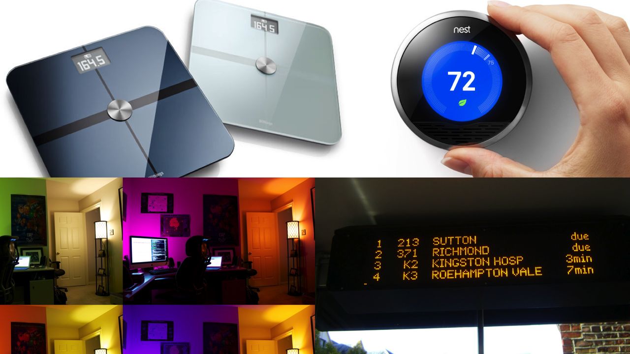
Scales that weigh you, analyse your BMI, the air quality, your pulse, and spit that data to the internet and to your cellphone via Wifi and Bluetooth.
A thermostat that adapts to your usage and, via Wifi, connects to the Internet so that you can control it from your phone, as well as see what it's up to.
A set of lightbulbs that can be set to any colour, scheduled and co-ordinated, all controlled from your phone via Wifi and shorter-range radio communications.
A bus stop that knows when buses are coming, via a data service and API.
That is, as you have probably guessed, a crude overview of the sort of objects – well, combinations of objects and services – that are being referred to as the 'Internet of Things'.
What I'm interested in today is what the word Thing in 'Internet of Things' means and can be; what happens when we go beyond some particular assumptions about what Things are.
Staring at those words written in front of me: well, I really don't like that phrase. It's so strange.
It others the Things – from the network they're on, and also from their users. Are they on a different network? Their own private internet? Not really. The point is how they co-exist alongside all other agents on the Actual Internet. I tend to use – and might well use in this talk, the phrase connected objects to mean exactly the same thing (and to make myself less uncomfortable).
Regardless, I think the same holds true: what can those objects be? And are there different models for what they can be – different patterns of usage? I think that there are, and I think a particular set of uses are under-represented. So today, through a variety of projects, I'd like to paraphrase Sesame Street, and consider that some of these things are not like the others.
I'd like to look at why they're different, and what the others can learn from them.
To explain why they're not, I'd like to show you a project from last year that I worked on, that explored what it'd be like to be in a city where many, many objects – a city's street furniture – were connected.
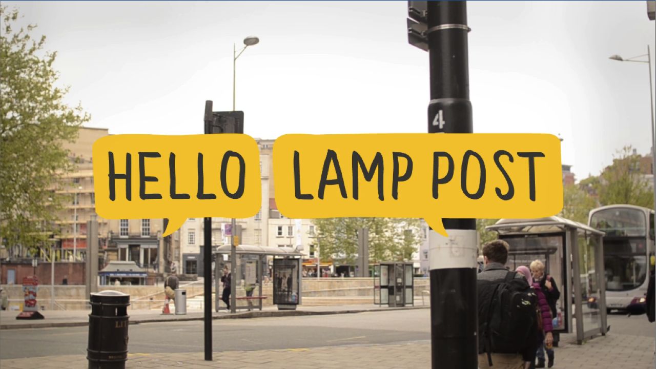
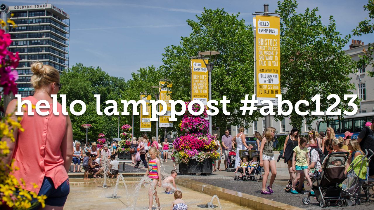
Hello Lamp Post was a collaborative project by PAN Studio, myself, and Gyorgy Galik. We entered it as a pitch for the inaugural Playable City competition, organised by Watershed, the Bristol arts organisation. We won the award, and the final project ran last summer for two months – from July to early September 2013
This year, it was nominated in the Digital category of Designs of the Year, at the Design Museum in London.

Watershed explained their concept of a Playable City thus:
A Playable City is a city where people, hospitality and openness are key, enabling its residents and visitors to reconfigure and rewrite its services, places and stories.
It is a place where there is permission to be playful in public.
I really like that quotation.
If the city is a platform – well, then, you ought to be free to play with that platform, wire and connect it as you see fit.
The Situationists, in sixties Paris, said sous les pavés, la plage – underneath the paving stones, the beach.
Well, the Playable City is a city built on the beach, not the paving stones above it. This is human, playful, gentle; very much the opposite of ideals about clarity, accuracy, integration, efficiency and refinement – all ideals that emerge in the prevailing rhetoric around "Smart Cities".
"Smart City": a phrase as divisive and, roughly innacurate, as "internet of things".
The designer Adam Greenfield has spoken of his preference for the description Networked City over the capital-S capital-C Smart City. He described the networked city as being made of
declarative actors and objects/spaces that have their own networked identities and shadows
"Smart City" is a marketing notion, wrapped around off-the-shelf, large-scale packages to be deployed onto urban environment and infrastructure. As Adam said at FutureEverything in Manchester this year – it's the 'imposition of technologies on people'.
What's more important is to consider all the discrete moving parts, the small pieces loosely joined, and how they fit together: networked systems, objects, and actors, interacting with one another at a distance, over APIs, legislature, process. These are all interfaces for the city. They're not all digital technology, either – they're frequently transitions between state, the digital communicating with the human, or the physical, or the abstract, and vice versa.
Cities are made of many different things, in many states, and digital technology's role shouldn't just be to bridge between all those states and the digital – but also to link things of one state to another.
I have some prior art when it comes to taking inanimate urban objects and turning them into networked actors. And, in the example I'll show you, you'll see digital technology bridging the physical to the human.
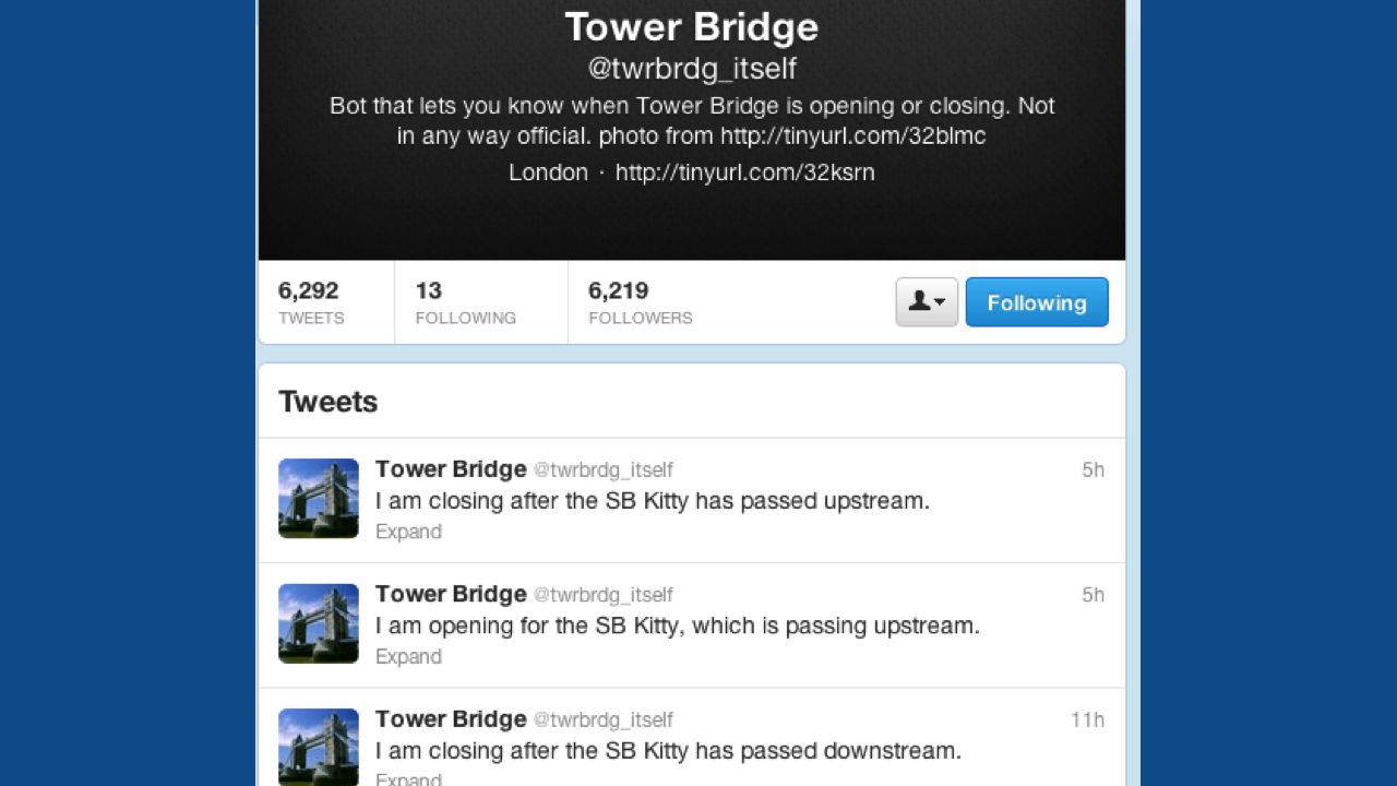
This is the first Thing (with a capital T) I put on the Internet.
In 2008, I worked near Tower Bridge in London, and I built this Twitter bot. You might have seen it before. It's really simple: it lets you know when the bridge is opening and closing, and for what vessel. I built it because it was there. The data's all publicly available, for free, and I had the technology to join the two.
I wanted to see what it'd feel like to have this information on Twitter for me and others – to have this object behaving as if it was just another one of us, bleating about what we were doing.
By taking this piece of infrastructure and mapping its behaviour onto a new platform (or rather, a stack of platforms – Twitter, the web, the network) – I was reminded that the city itself was already a platform. Not a hierarchical one: a city is a big jumble of services, almost like Unix. A Network of sorts.
We very much wanted our Playable City to be an antithesis of the Smart City.
For starters, we wanted to use as much of what was already present as possible. The city is a surface – a platform – to build upon, and it already has many layers – the physical above and below ground, the legal, many digital representations. Adding another one felt ephemeral, temporary: wouldn't it be more relevant to show that Bristol was already playable? To use all those existing components within the city, and find a way to draw them together?
We would embrace the existing platform.

We spent a lot of time scouring the city for opportunities. We thought it would be interesting for the street furniture you see in a city – lampposts, postboxes, bus stops, cranes, bridges – to be intervention points. That way, we could use the existing infrastructure for our own purposes. But we'd need to find a way of interacting with them – of identifying them.
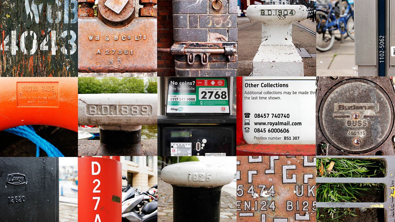
And then we noticed that a lot of street furniture has unique reference/maintenance labels.
We'd turn all these objects into the networked Actors in our playable city. They'd be participants to interact with, to see the city through a new lens with. Just like I'd done earlier with Tower Bridge, we'd find a way to bring them to life that was meaningful but without necessarily installing technology in them: a reminder how many of the actors in our cities are not necessarily people.

Although we were manipulating the objects within a city, we wanted to reminder players and participants that ultimately, a city is made of citizens. So Hello Lamp Post would also highlight the human element within the city.
We kept coming back to the idea of the city as a physical diary. We discussed a lot, from an early point in the project, how memory is so often inextricably linked with place. The city becomes a map of your memories there, all the good times and the bad mapped onto bars, streets, bus-stops that you sat in waiting for the last bus after a terrible evening. It's all overlaid in this spatial layer.
We wanted to help other people to see this way, by sharing past experiences and stories with each other.
And, crucially we wanted to do that for the most people, at the largest scale. The city is a platform with a huge potential audience, and to make a truly Playable City, we'd have to engage as many of them as possible.
Firstly, that meant making it super-accessible. An app for a smartphone might be cool and have GPS and that, but it limits your audience; we wanted a more diverse audience. Children often have cheaper PAYG devices; when we made Hello Lamp Post, these were rarely fully-featured smartphones; they were usually 'featurephones', perhaps with a keyboard in the manner of a Blackberry. Older citizens were often using the most basic Nokia or equivalent that their children have bought for them.
They weren't going to be core consumers for a GPS-based app.
By contrast, everybody understands SMS – every mobile phone has SMS. It's relatively simple to implement now, too: Twilio does the legwork for us, turning simple HTTP POSTs into SMS messages. Superficially unexciting technology made super-simple by web-based services.
And everybody, it turned out, quickly cottons on to the idea that any code, on any object, will do to identify it.
Those codes are much more tangible than GPS and quite commonplace. You wouldn't need a smartphone to join in, because we'd locate you by you telling us where you are. Which seems obvious, when you think about it.
At the time, I jokingly said that the Smart City uses technology and systems to work out what its citizens are doing, and the Playable City would just ask you how you are.
What we ended up, after all this, with was a playful experience where you could text message street furniture, hold a dialogue with it, and find out what other people had been saying.
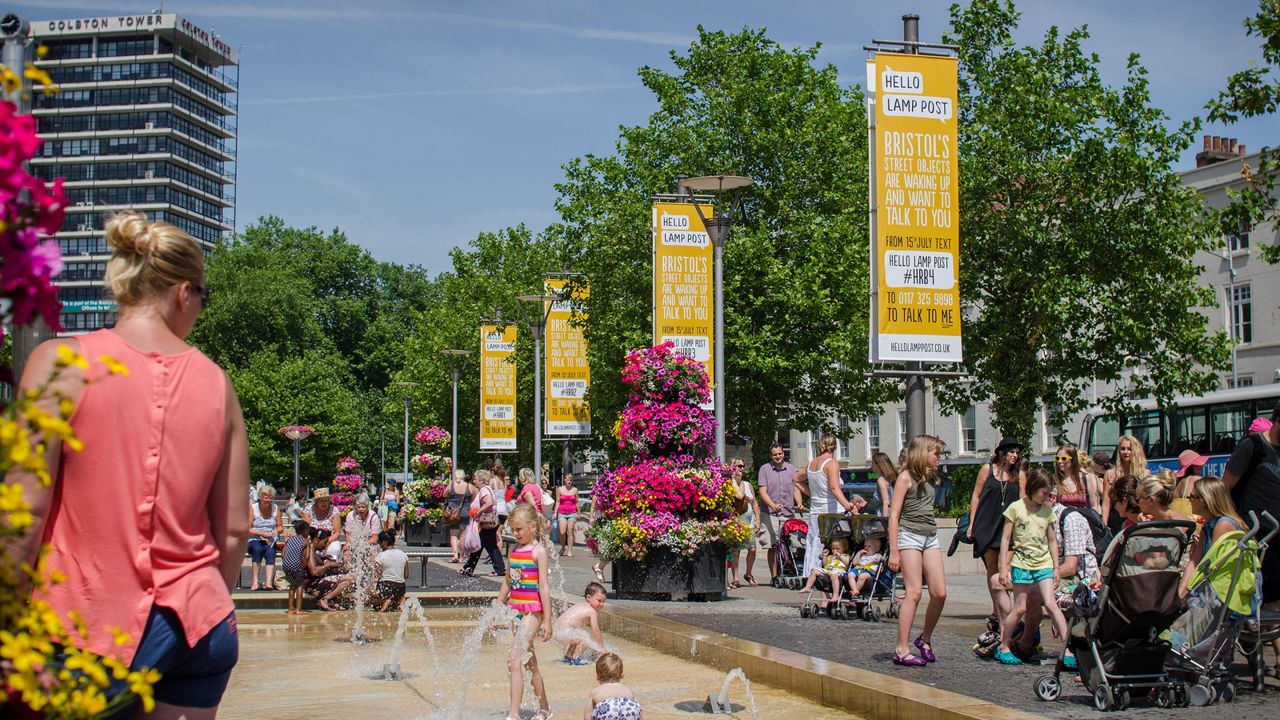
To induct people into the idea, we needed to make it legible – it's a fundamentally invisible system otherwise. Watershed helped us with a physical advertising campaign. Objects like the poles in the image above were our hero objects: the banners hanging from them told you how to talk to the object they hung from, giving you the entire instructions on the poster. "
Text hello post #code to number". It was super-satisfying that the posters could all be the entire user manual for the game. You do what they said, and off you go: you were talking to a lamppost, or a bridge, or a crane, or one of these poles down near the waterside.The majority of players interacted with these objects first – but many would then go on to play with other objects in the city, once they'd understood it. It helped give the invisible system form, helped them understand the breadth of objects that were part of it.
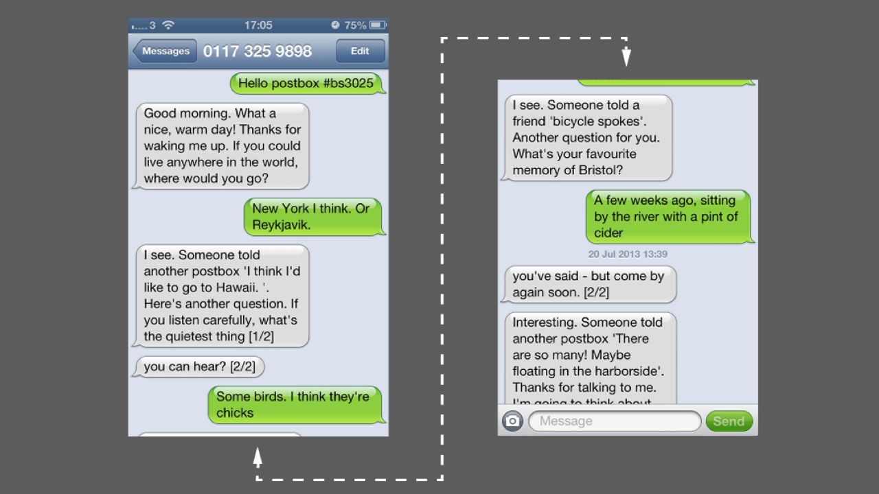
I suppose I'd better show you what a conversation looked like.
Here, you can see what a conversation looks like. I greet the postbox, and it asks me a few questions, some of which might be particularly "postboxy". (Postboxes are particularly interested in travel, for instance). I give it some answers, and it tells me what other people have told it, or things like it, or just other objects. You can see it also knows what time it is, roughly, and what the weather is. And, right at the end, you can see an exciting side-effect of SMS: we split a message longer than 160 characters into two messages, and send them, but that's no guarantee they'll arrive in order! Hence why we numbered the messages. (Twilio now supports concatenated 'long messages', but at the time we had to build it ourselves).
We were creating a ritual, about talking to street furniture. As you talked to the same object over time, it'd become more friendly, more intimate. Other, brother-and-sister objects would know what you'd said to their compatriots.
The writing is careful – it's humane, it's playful, but it stops short of anthropomorphism. The objects don't pretend to have full blown personalities. They don't change their mood. They know about thing you'd probably expect them to know about: the weather and time of day, which seems reasonable, and they ask you questions and tell you other responses, but they don't pretend to have feelings.
By engaging in our little playful intervention, we hoped people might understand the other Bristols that exist for its other citizens. We hoped they'd begin to see the world differently – not just seeing all the street objects they might otherwise pass by, but also see all the perspectives they might not otherwise see. How did what a lamppost in a poorer area of town heard compare to its brothers and sisters on the waterfront? The same system worked everywhere, so perhaps it would expose similarities and differences across the city.
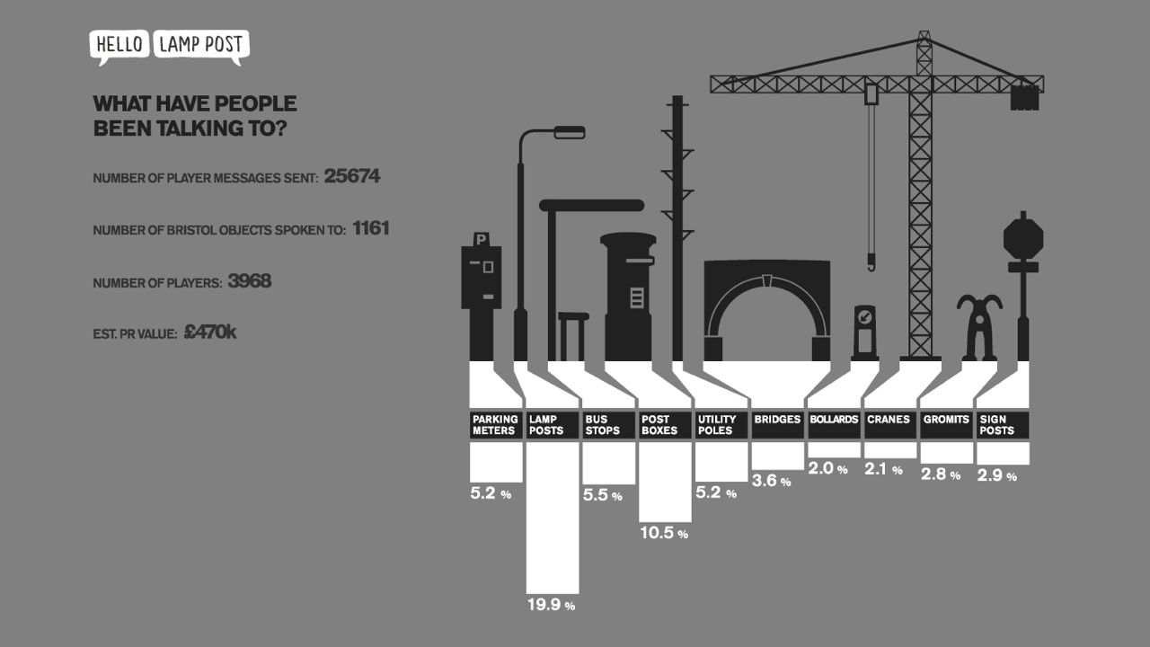
The project ran for two months last summer. We had just under 4000 players over the two month run, who collectively engaged in over 9500 conversations -speaking with over 1000 unique objects and ultimately sending 25000 messages our way.
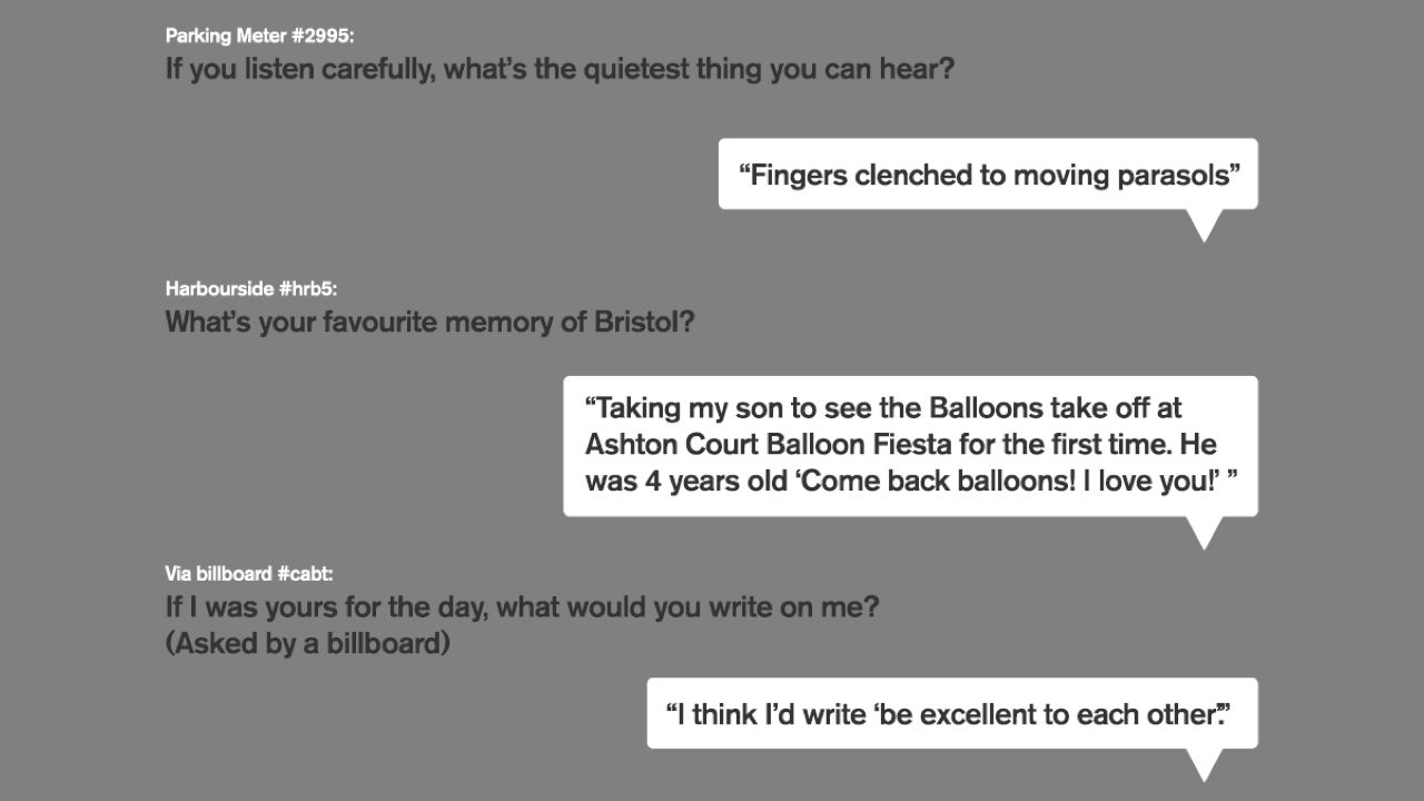
But what was most exciting was exactly what people were saying; what they were sharing about their particular Bristol with others; what those moments of ritual were creating. From the poetic, to the local, and the personal. And of course, because of the way the game worked, other people answering questions would see these via their phones.
And of course, the apt questions for particular objects led to particularly great answers.
Our hope – that this interaction would lead to these interesting perspectives – had been validated.

Why am I telling you about this playful toy, though? How is it relevant to the connected objects that I showed you earlier?
Well, I think it's important to consider the interactions and ideas here as part of the continuum of connected objects. Whilst we were clearly making something that had an element – just an element – of smoke and mirrors to it, these were real interactions that real people had, standing by objects in the environment around them.
Matt Webb described Hello Lamp Post in the Designs of the Year programme like this:
A poetic glimpse of what the future of user interaction will be in the 'internet of things', a technological vision where artefacts and physical environments are connected to the network'
Perhaps you can see an echo of his talk this morning in that. (Matt gave the opening Keynote at Web Directions South)
That is exactly what I hoped people would take away from it. Yes, there's a charming, playful interaction here – but there's also something else. There's a suggestion of a different way to interact with the city beyond apps and dashboards: something light, something conversational, something social.
And something civic: objects that are part of the network, but situated in the world, shared by their citizens.

So often, the focus on connected objects in popular media that we have right now is products like the Nest, the Hue, the Withings Scale: luxury objects that cost more than a non-connected alternative, targetting early adopters. Some of them are very well designed; some of them are very useful.
But they're for a small audience.
Connected Objects are not just white goods with a Wifi chip. They're objects that are made more useful through connectivity. That might be because they send data somewhere; it might be because they show it. It might be something that connects the data-representation of itself to the physical manifestation of it; it might be something that highlight the system it's a part of.
I think that the largest audience for connected objects, right now, is for civic objects with shared usage: the networked city.
That's why this bus stop isn't like the other Things.
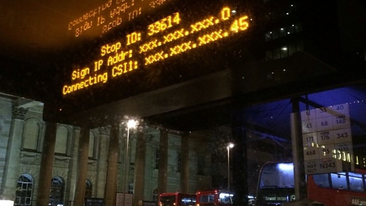
In fact, I would bet that the connected object that most people in London engage with, right now, is this: the LED display in a bus stop.
Nobody owns it; it's not a luxury item. It's a timetable made vastly more useful through network connectivity – and through the situating that data in the place it intersects with reality.
On the previous slide, you saw one of these when it's working. But, on the internet, everybody always loves taking this picture, of a dead bus stop showing you its IP settings – "isn't it funny that it's broken? Isn't it funny that it's just another crappy computer, like the one I have at home?" Really, though, we're taking a picture of precisely why it's an interesting object.
My Mum has a similar bus stop at the park and ride in the town where she lives. But it's not on the network: it just displays a fixed timetable like an animation. It is more than useless, really: it's a clock that's right twice a day. It feels strange to have to explain that where I live, those bus stops are not just accurate but alive.
This bus stop is part of Greenfield's Networked City: not a giant system, but separate objects with networked identities. The buses have GPS and a network connection to tell the system where they are; the system updates the displays as appropriate – and also the various public APIs it supplies to developers. These objects are part of larger systems, working together.
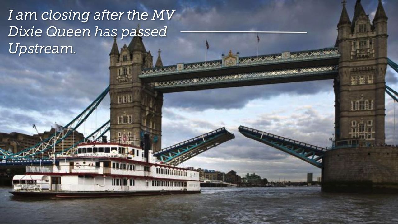
The Tower Bridge bot is another networked actor.
It's a bit different to the bus stop, though, and indicates an important aspect about these networked actors in the city: they can have a meaningful presence on the network without themselves being connected. Tower Bridge is not, I hate to say, tweeting the second its motors spin into action. I didn't install any hardware!
Instead: a server is tweeting when the timetable (another manifestation of Tower Bridge) says it's opening. To all extents and purposes, the data-representation and the object are mirrors.
(Hang on a second: are they? Well, they are to a certain number of significant figures. Whether you think that makes them the same or not is partly a personal decision, and also something we'll come back to. Anyhow.)
What makes it feel like it's the bridge itself tweeting, weirdly, is not the mechanics of how it works, but the fact it behaves like anyone else does on Twitter. It talks in the first person. That's what you do on Twitter. When I made it, the question Twitter prompted you with by its textarea was What are you doing? And you naturally answer that.
We all speak in first person on it; so if you're going to put devices, objects, buildings, or infrastructure on Twitter – surely it makes sense for them to do so too?
And that first person, present tense voice pulls an interesting cognitive trick: it suddenly feels like the object itself really is talking. Which leads to an interesting proposition around identity.
Namely, the idea that a representation in the mirrorworld can represent a particular real-world object isn't necessarily related to whether the data is coming from the object itself.

When we interact with Hello Lamppost, with Tower Bridge, we don't care that the object itself isn't connected to the network: it feels and behaves as if it is, and that's often enough.
Is that a lie? I don't think it is. With Hello Lamp Post, it was clear from the conceit that the objects were not talking – there was some kind of magic there. It just wasn't quite the magic you think. The magic was not entering every object in the city into a system: it was making the whole thing work for any object in the city. It's no surprise we talked a lot about cold reading – you know, the sort of techniques used by mentalists or psychics to tell you things about yourself – in the early stages of the project. Could we get the objects to say things that couldn't be wrong?
In our early playtests, the system didn't pull that off. It wasn't that one bit wasn't right: it was that the whole thing fell apart a bit. The tech didn't quite parse messages right; the tone of the dialogue wasn't quite right; sometimes, it made assumptions it shouldn't have, or it prompted for questions accidentally. (One thing we learned: only put any text in ending in a question mark if you want an answer to that question. Every time, as a conjection, an object said really? people would answer that, rather than the next question, and it all got messy.)
But we fixed all that. Sometimes, by simplification: making the format that you saw earlier, tightening up the options on offer, making sure the object would rather say nothing than say something that might be wrong. (Like true Brits, our objects only talk about the weather if it's especially wet/sunny/cold. If it's vaguely grey or maybe a little damp, they just don't bother saying anything). And the illusion suddenly tightened up.
Tower Bridge is a bit different though, hence why I asked you to think if you had a problem with the data-representation standing for the real thing. It feels realistic when you're on Twitter, that's for sure. But if you're standing next to it with your mobile phone in your hand, and you're looking at it, and Twitter says it's closed – when really it's 10 minutes late opening... how do you feel? Do you feel lied to? Or do you not care, because a talking bridge was always going to have some magic or deception in it somewhere and now you've find where the stack falls apart?
I'm OK with it, because it's figurative: it's existence is its meaning. Some people find it functionally useful – cabbies and cyclists have both told me they've used it as a tool – but they seem to have implicitly understood the abstration, the trade-offs at the heart of it. Which is interesting.
My point is: Sometimes, joined-up is as good as connected. But, in the space we've got to discuss this, I think it's important to note that if you're going to make an abstraction, smooth over some cracks: be sure to either be completely explicit about that, or, if they don't actually matter, consider creative, charming ways to paper over them in service of an illusion.
Importantly, though: if the abstraction really must be understood – usually an issue with serious, important service, don't paper over it.
But even if it's not serious, if breaking frame or the facade falling is a bad thing: you're going to have to work hard at perfecting that facade. We spent a long while on the polishing of Hello Lamp Post, making sure it would never fail in a catastrophic, frame-breaking way.
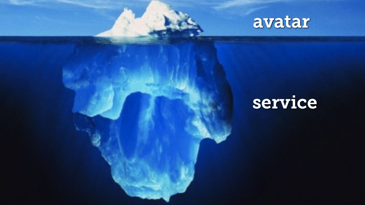
Earlier, I described the world of data as a mirror-world – a term I'm lifting from David Gelernter; this idea that there's another world that mirrors ours, reflecting it as information rather than reality. These connected objects manifest both in our world and inside that data-world. And our interactions with those connected objects reveal that data-world through the physical object.
Connected objects extend beyond themselves, like an iceberg, into the invisible. They are avatars of something larger than themselves.
Mike Kuniavsky coined the term Service Avatar several years ago to describe the role connected objects take. Connected Objects, done right, are rarely just a device with a network connection: they're a material representation of a wider system.
This is why, say, I enjoy Instagram so much: it's a camera that also has my friends' photos in alongside mine. By placing upload and sharing into the camera itself, it stops being a camera and becomes a manifestation of that end-to-end service of take/share/browse/comment.
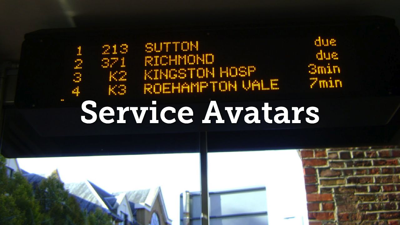
So going back to our bus stop again: the bus stop is a service avatar for TFL. Yes, it's giving you factual information: but it's also an avatar of the networked platform, the buses, the APIs, London Transit as a whole. It's synecdoche – the part standing for the whole – of London Transit.
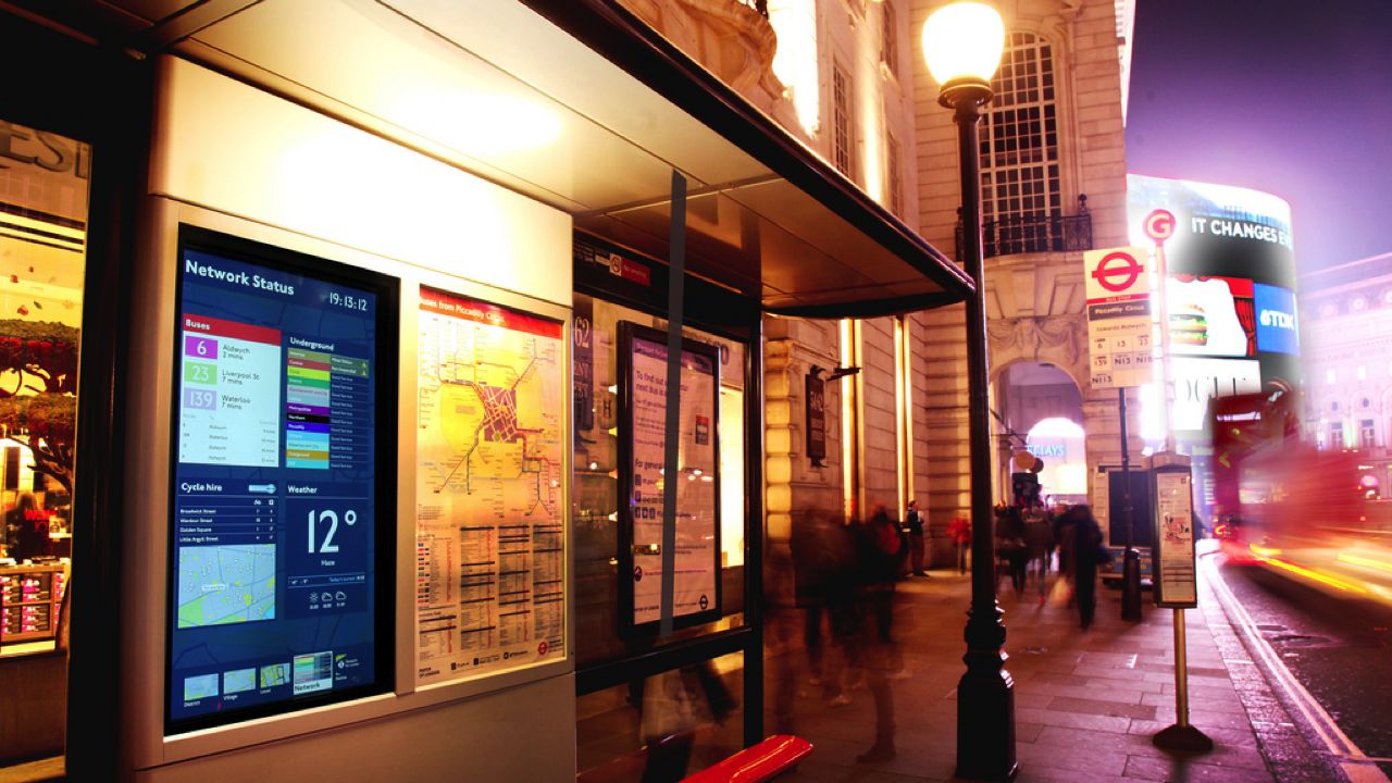
But it's very one-way. If it's an avatar for a whole service, why can't I talk back to it? The connected objects we see in the consumer space are personal – they give direct benefit to the user. Civic Connected Objects too need some kind of personal focus – it's not enough to just be a display for everyone, like this trial of a new realtime display in London (a collaboration between TFL and ClearChannel).
So what are the new interactions for civic connected objects that are personal, functional, and two-way?
Why not an email from a station I passed through earlier in the day to let me know it has severe delays, in case I'm going back that way tonight?
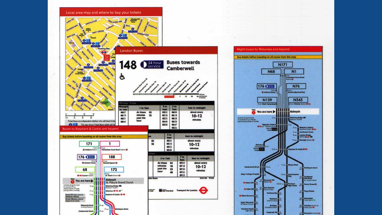
The bus stop only shows me a timetable for services from it. What if I wanted to know how to get from here to anywhere else? Why can't I just text it and find out? I don't want to tap on a big screen and show everyone else where I'm going.
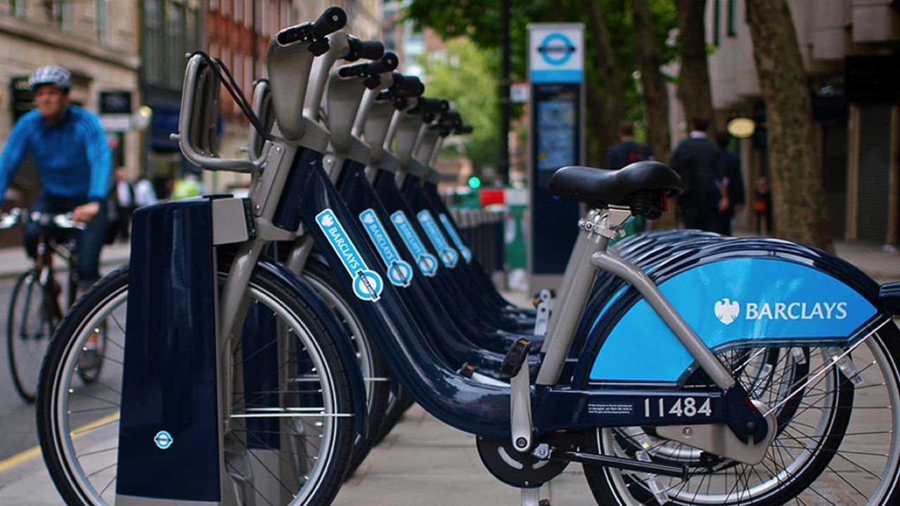
Why doesn't my hire bike know its way home – to the nearest empty bike rack – even if I don't know where that is? What would that object be like if it was connected, and illustrating the data that TFL already makes public?
I decided to find out.

A common pattern of use for London's hire bikes it to pick one up, ride it to wherever you're going – which you normally know the way to – and then pull out your smartphone and use one of the many apps that's out there – all using official TFL data – to find out where the nearest empty rack you can park in is.
That last component is a fairly critical part of the system for many users – it certainly improves it no end – but a smartphone feels like a very high barrier to entry for what is supposedly public transportation; transportation for everybody.
So what if we embedded that data in the object itself – turned it into an avatar for the service?
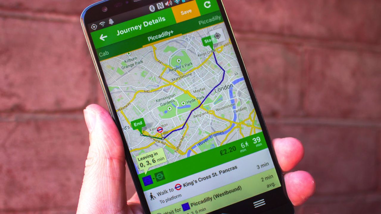
So to be blunt: What if a service like Citymapper wasn't in my £500 mobile phone, but in the city itself?
This is Columba. It's named for the genus of the pigeon – and chosen because pigeons are both a common sight in London, and good at finding their way home.
It's a compass for hire bikes, that always points towards the nearest empty station. The width of the indicator shows you how close you are.
When another station becomes nearer, it flashes green to let you know.
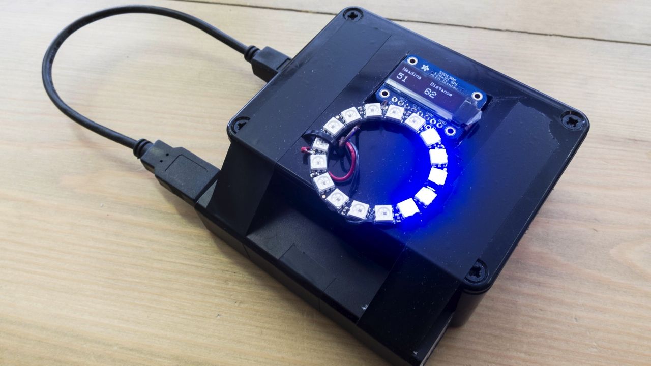
Let's talk about practice and craft, briefly. Columba is a simple prototype. I've described it previously as an experience prototype. What do I mean by that?
Its goal is to explore the idea, to understand the problem by holding it in your hand, and to demonstrate certain thoughts. It's not an object to sell (not that I'd want to – I'd want this built into a bike) and it's definitely not the way you'd build this thing for real. But it is definitely enough to understand what it feels like when the bike knows where it is; how it changes how you use the bike – and also enough to understand the grain of the materials involved.
I say this in a lot of talks, and it's a strand of thinking indebted to my time at Berg, but I'll say it again: technology is a material – a family of materials – like any other, and to understand how to make things with it, we need to manipulate it with our hands. We need to feel the grain of it. Just like the wood Columba is sitting on has a grain – along which it's much easier to manipulate it – well, so do programming languages like C or Python or Swift; so does technology like RS-232 or Wifi or 3G or Zigbee; so do data and interfaces like APIs. We need to understand those materials.
We don't understand materials – not really – by reading the manual. We read it, sure, just like we know the on-paper tolerances of a sheet of metal, or of an electronic component – but we still have to understand how that translates to the real world.

The way to understand a material is to hold it in your hands – and, usually, to find ways to sketch with it. In some ways, Columba is a physical sketch. It is constrained enough by real conditions to understand what those conditions mean. It's not just a fag-packet sketch, an idea tossed to the wind. I had to feel that grain to understand it, have a thing to show you.
The conditions in particular that I was exploring were making it self-contained; battery-powered; using 3G connectivity to update itself, from real data.
There's an earlier prototype that is a iPhone-specific web app. That was my prototype for understanding the data; later, it became the back-end for the physical version of Columba.
What did I learn from all this? For starters, It became clear that it probably shouldn't be always on. A button to interrogate it – as if you were asking the bike "where do you live?", rather than it constantly telling you – is much more empowering for the user and less distracting. You would get the information when you need it. It changes the interaction model to question and answer, rather than a stream of data.
I was reminded that the public data set is around 15-minutes out of date, which isn't a problem most of the time, but is at a mainstream station in rush hour.
I also remembered that I'm still not very good at riding bikes.
But: I also had it confirmed that the model of pointing in a vague direction and letting the human riding use their nous as to where to go is a good interaction pattern for cycling, and it doesn't feel, as a whole, an entirely outlandish experiment. I confirmed easy ways to prototype 3G interaction, and I discovered that the OLED screen was in many ways, more useful than I realised – I was planning on just having the ring of lights, but the high-contrast OLED is so readable, there could be utility such as street names or other textual data displayed there.
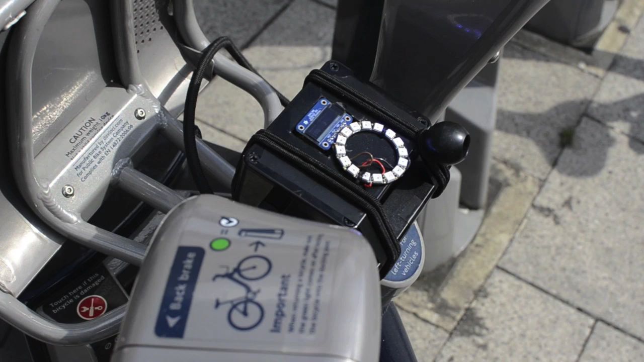
What you see here is a project box tied to a bike – but imagine it as an immutable part of the bike. Not on a phone; just a GPS, 3G modem, and a ring of lights – perhaps that tiny OLED screen – added to the Bill Of Materials of your average hire bike. As minimal as you can get.
But how radically it changes the service: how much it encourages you to use it if you don't know where docking stations are, or helps you find a spot at the busy times of the day. Manifesting the networked shadow of the hire system in the bicycle itself has changed a user's relationship with it, and their possible interactions with it.
By thinking about how objects manifest the services that underly them, or how services can manifest in objects, we start moving on to think about what the appropriate interactions with those services are. Not just "what does the user do", but "how does what the user does relate to a larger model". Do their interactions with the avatar reflect their interactions with the service?
Interaction Design is not just about designing things to interact with; it is about designing those interactions themselves.
Too often, connected products reach for the same, simple metaphors for interaction. There's a particular pair of patterns I'm a bit wary of, and I call it Big Stick and Binoculars.
Firstly, Binoculars: being able to see the control panel from further away. "I can see the controls on my phone!"
And then, once you've got your binoculars, the Big Stick: "I can push the controls from further away!"
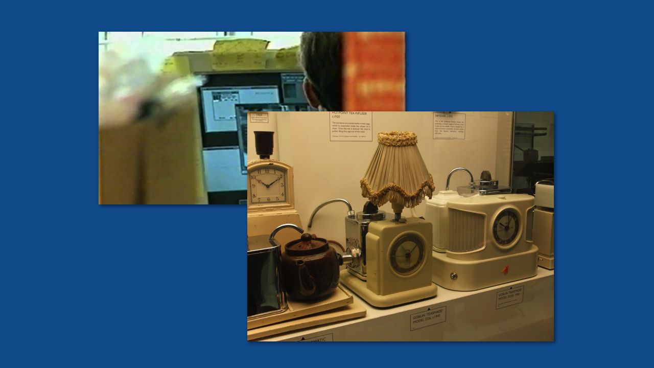
These patterns are those of two canonical smart objects. First, the Trojan Room Coffee Machine, first made in 1991: a dedicated tool (that'd later become a website) that showed a camera image, piped through a video capture card in an Acorn Archimedes, to let people know if there was coffee in the pot. The object isn't directly connected, but the interaction really is the same.
And, secondly, the Teasmade. A bedside kettle attached to an alarm clock that boils at a particular time, so you always wake up to fresh tea. First made around the turn of the 20th century, it's not connected, and it's barely smart. But: it's a big stick fired through time, to the next day. Action at a distance.
Worth saying this slowly, and clearly: neither of these are bad interactions; sometimes, they're exactly what is needed.
For some products, a Big Stick or pair of Binoculars can be surprisingly effective – not having to check to see if there's coffee, or turning the coffee on remotely, are still somewhat interesting new behaviours. There's definitely value there.
But when you're combining an object with the services it represents, entirely new interactions become possible – and perhaps the point of designing Connected Objects is the entirely new things you can do with them. What are the things that are only possible when the service, and the object, and the data, and the network are joined together?
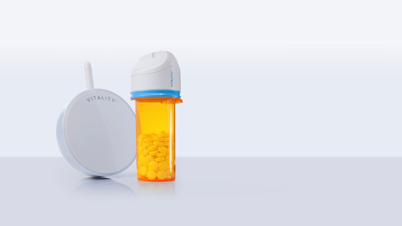
This is why artefacts like Glowcaps are so interesting – a pill bottle that reminds you when to take its medication, instantly, wirelessly.
It doesn't just replace the functionality of the safety lid but with electronics; it also hooks into the variety of systems the medication represents – refilling your prescription at a pharmacy; distributing the medication according to your specific prescription from a doctor; notifiying caregivers; integrating with insurance providers.
It's a compelling connected device precisely because its interactions go beyond Big Sticks and Binoculars and into a connected, networked realm. The problem, then, with the Big Sticks and Binoculars is not the "action at a distance" and "seeing further" aspects of them; it's taking those literally, when we also have the network available to us.
The Glowcaps bottle is connecting itself and all of these components across seams.

Seams: the things between things.
What sort of seams do we see in connected products? The seem between a data source and the data being logged (so, say, from performing the act of running to a fitness device measuring that act); between that device and your computer or phone (and there's a seam in terms of the software and interaction, but it's defined by another seam – radio or cable or USB); between the computer and the network; bewteen one service and another – ie, bewteen Runkeeper and your Facebook account, or between a Belkin Wemo camera and your email.
And there are seams we cross inside interactions – when we move from the public to the private, such as entering a password or other security credential; or when we move from an automated service to one where we interact with a human being.
These seams can act as speed bumps: they slow us down, remind us that there's a connection between things, that different agents are at play.
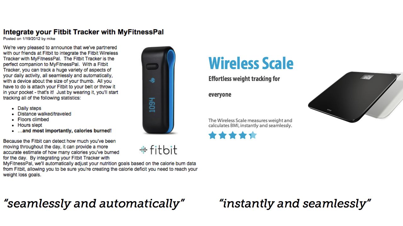
So often, connected objects promise us that they're seamless.
But this seamlessness is seductive and dangerous – because by hiding the seams, we often hide to the user where points of failure might be until it's too late.
Here's a great example.
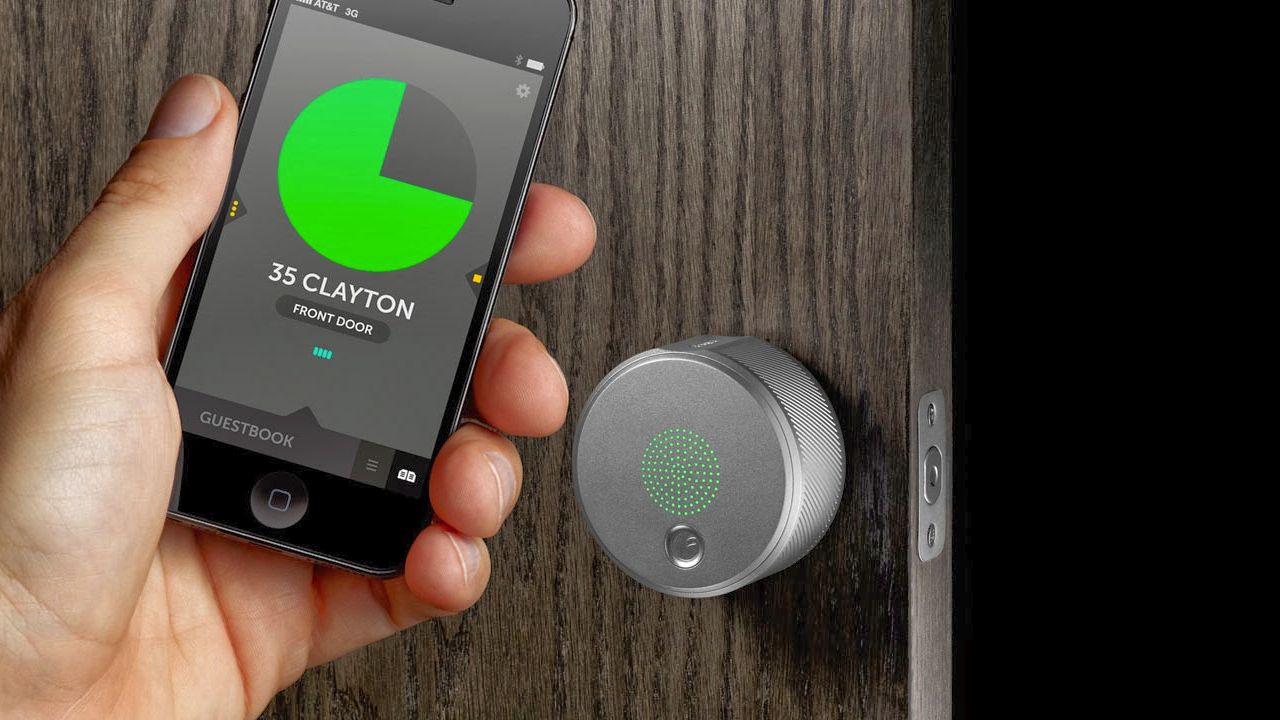
This is an August Smart Lock. It's hitting the US market right now. It attaches to the deadbolt of your house's front door lock, and can then be controlled from your phone – either directly, or also via proximity.
Techcrunch just reviewed it, and, I don't know, it didn't leave me feeling great about the product.
First, the promises of seamless, automatic entry/unlocking was thwarted by his housemates:
"...much of the utility of the lock was negated by the fact that I have roommates and not all of them were willing or able to download the app to test it out with me [...] My dream of using Auto-Unlock was stymied basically because my roommates are luddites."
Then, the promise of seamlessness was threatened by implementation:
"Every now and then it didn’t recognize my phone as I approached the door."
And so now we have a lock that can't be trusted – which comes full circle in what for me is the highlight of the review:
"There was also one late night when a stranger opened the door and walked into the house when August should have auto-locked the door."
that's mitigated in the review by the following –
"(The stranger was trying to enter our next-door neighbor’s house and didn’t realize he was at the wrong door."
– but WHAT THE HELL?
The lock failed silently and seamlessly and let somebody in.
Here's the think about locks, and doors: they are excellent seams! They are a speedbump to entering your house. They are designed to make you stop a second and prove that you have the credentials to enter. Seams are points to make decisions, choices, and actually – as a user – to be empowered, rather than ignored or assumed.
Houses last hundreds of years, if you're lucky. Locks... are pretty resilient too. But I, personally, would question trusting a consumer electronic device at the level of fidelity I do the edifice of a house.
The promises of seamlessness aren't just thwarted by implementation detail, like unwilling housemates; they can also be a dangerous abstraction. So instead of seamlessness, why not embrace the seams?

This is what Matthew Chalmers described in the context of what was then called 'ubiquitous computing' or ubicomp, as seamful design:
"Seamful design involves deliberately revealing seams to users, and taking advantage of features usually considered as negative or problematic"
And he goes on:
"Seams in interactive system designs and infrastructures show through in users’ interaction, but we can design for such seams. We can help users understand and adapt our systems and their activity, with design that weave transparent use and more analytical use together into... 'the fabric of everyday life'"
He's not advocating exposing all seams; but he is advocating exposing the meaningful ones. By exposing those, users can come to a better understanding about what's really going on in a connected object: where data transitions from one place to another, or changes state; where potential failure might lie; what they need to be aware of.
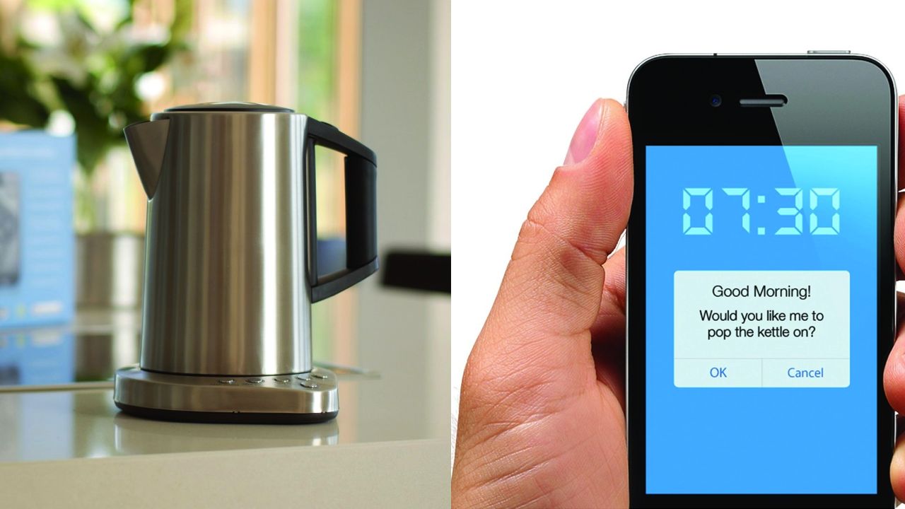
There's no bigger seam for the connected object than that between the object and all the services it connects to.
Will that service be around as long as your product? Sounds silly, especially if it's your service – but plastic and aluminium will long outlive your acquihire. Seams, after all, are traditionally points of failure. If your trousers are going to rip, we all know where that rip's likely to fall.
How long will the Maplin iKettle work? Does it have a centralised server or not? If it does, what when that goes down? If not, what when the company no longer makes iOS updates for it? At least at the end of the day you'll still have a $200 kettle that can boil water.
It can boil water without the network, right? (Yes, it can).
So what are the ways around that?. And, more to the point, how do you communicate that to the end-user, be they consumer or domain expert?
Maybe you're not running a service – maybe you're integrating with other services, like Glowcaps.
What is the ongoing life of this product going to be like?
Well: how long will they be around? Does that industry – health, say – only work that way in one territory? What about when I move house? Or emigrate? Does my seamless service cease to work, or is there a clear way to swap it out?
Seams have meaning, too. Think about the fitness space. Different services can have different meanings to their audiences – and are they all appropriate? Will some casual users be put off by a lack of a particular integration, or will they be put off by the message your existing integration list sends – that it's all, say, services for serious athletes?
Like Erin said earlier: we create things that people will spend their time on; possibly a significant quantity of time. So bear in mind that when you make something successful, people might well build their lives around your product. That's a lot of responsibility, and what are they going to do when you leave? That's not just lock-in to a particular service, it's an emotional lock-in, too.
Trust is a big thing to ask. When the service and object are this closely linked, a failure of trust in the object turns into a failure of trust in the entire service. When TFL's data breaks, it's not them I swear at; because when their data breaks, Citymapper breaks, and it's Citymapper, the third-party product and service that uses it, that I start to question.
Seams can be a place to mitigate that trust, rather than jeopardise it.

For instance, Tower Bridge has this huge seam that becomes visible when people talk to it and I reply in its voice, as a puppetmaster. They can see that the Magic Voice it talks in when spoken to is not the same as the Automatic Voice it normally has. It makes them laugh, but it also makes it clear that it speaks in two tones, and the humanity of my puppetmaster voice reminds them taht most of the time, it's not me, it really is automatic. It reminds the user that it might be useful as a side-effect, but it's also an entertaining, provocative toy; it frequently downplays its usefulness.
Hello Lamp Post, similarly, has a huge seam at the entry point to it. Namely: you must address it in the correct format to start conversation.
We can't hide that. (Well, we could have, but I wanted to avoid Hard Problems like natural langauge processing, so we simplified and used a convention instead). We're really explicit about it too – hence the posters with the full instructions on.
We have that big seam, but people don't mind it, becuase we tell them about it very explicitly. From that point on, they can say whatever you want – and then everything else in that interaction is very fluid and freeform. The next time they want to start a conversation, they know how to begin it – the friction is already reduced. By emphasising the boundaries and seams, we actually made the user experience better, and made the later 'magic' of the experience more effective.

Connected objects and services in the urban environment need to be resilient to failures in the object, resilient to failures in the technology – and also resilient to failure on the part of the operator (a lack of understanding, a mistake you made). Columba is deliberately vague in order that it is wrong less often. The bus still arrives even if the timetable is broken: there is a paper timetable, there is an online service, and so forth. All the digital service is doing is offering a higher resolution of truth – the information is degraded but not lost.
Cities – and the things in them – transit, infrastructure, services – last. The default for a city, so often, is resilience.
Cities have the broadest range of possible users, and that presents the broadest range of seams, between all those different types of users and the services and objects of that city. Cities also can't abandon existing analogue interactions, of paper, and cash (though they try); they have to sit alongside the digital; services that present a variety of ways to interact and afford them all.
When done well, they make their seams really obvious – seamlessness is too much of a risk with that many unique use cases – and so the connected layer becomes evident – and not dependent on the user's devices, income, or technological competence to operate.
And I think this broad, resilient, approach to designing connected objects – designing for the wide use-case first, and understanding the seams throughout the product's journey – has a great deal of value in how we design products and service in general.
The cities we live in, the infrastructures we engage with; these are long-term relationships that don't orbit around what OS is running on our phone this year or what brand of trainer we wear. They affect lots of people, in lots of ways, and have to work for all them. So perhaps, even when thinking about the smallest, most personal object, why not start thinking about them from the broadest perspective; what the hundred-year lifespan feels like – what they might feel like when they acquire the tsukumogami that Matt talked about this morning.
When we're thinking about making Connected Objects, Things on the Internet, diversity and ingenuity in considering what we consider to be an Object, what might be a Thing, feels critical. Not just what objects we can most easily connect; not just Things With Wifi. Instead, things that are radically different for being connected, and that anyone can engage with; that make their seams clear.
This may be a stretch to come from what happened when we made a city talk for a few months, but I think there are many good lessons to be learned from the civic space, as I hope I've shown today, to what connected objects can be.
I think the potential for Connected Objects – for the Internet of Things – is most interesting at its broadest, most democratic and social edge. The places that happens aren't just in the homes of the affluent, but in cities and publics, spaces where objects are so often owned communally – and those objects and interactions are things we can learn from and build upon in our own practice.
Thanks.
Speaking at Web Directions South in October 2014
26 June 2014I’m pleased to announce that I’m going to be speaking at Web Directions South, in Sydney in October of this year.
My talk is called What Things Are:
If we’re going to talk about an Internet of Things, we should probably talk about what we mean when we say “thing”.
So often, when we talk about the “internet of things” it brings to mind images of consumer white goods with Ethernet sockets or Wifi antennas: thermostats; weighing scales; the apocryphal Internet Fridge.
But that’s a narrow way of thinking that’s perhaps unhelpful: whatever you may think of the term, an “Internet of Things” should embrace the diversity of Thingness.
So what happens when you think about the diversity of things that might be on the internet, and how they might behave? What about Things that people don’t necessarily own, but borrow, share, or inhabit? Through projects that connected bikes, bridges, and a whole city to the network, let’s think about What Things Are – and what they might be.
It’s a longer riff on A Lamppost Is A Thing Too, and is probably the final outing for that train of thought. I’m greatly looking forward to it – it’s a cracking lineup – and I’m flattered that WDS invited me. See you in Sydney in a few months!