Lunar Energy: Gridshare Dynamic Brand Animation
Thinking through making to build a generative animation tool.
This project was the final one of a number I did in 2023-2024 for the Design team at Lunar. I like it as a case study because it’s a particularly good example of thinking through making. The outcome of the project doesn’t quite align with the original brief. But that’s because of what we discovered in the process of exploring the work and following our noses.
As we made things, and worked with the things we’d made, the possibilities of the work became clear, and the client’s ambitions and ideas changed to match.
I’ll paraphrase the original brief to start:
We’d like to make it easier to make video ‘stings’ for the beginning and end of all the footage we put out about our ‘Gridshare’ product. We’ve got this idea about a grid-like network that ‘grows’ organically; it’d be great if we could generate these on demand and spit out and mp4 using something like
ffmpeg.
The design team had some mockups and also some initial javascript sketches. This definitely felt like one of those “Tom-shaped projects” - software-driven design, building tools for other people, weird application of video tools.
This was a very organic project: I worked against the brief, first occasionally meeting with Matt, the Design Lead, to chat about it, but then moving to a group Slack where I’d share progress with the entire project team, and we’d all chat, crit, and share ideas.
Matt’s written more about the brief and the project, from his perspective, over here.
The ‘creature’ metaphor
I started by looking at James’ original code-based animation, and trying to make something that looked similar. I sketched in p5.js: a nice clear API to work against, well-suited to realtime graphics work, and it later could be wrapped in a reactive web-based UI to adjust parameters.
My first prototype worked by randomly placing invisible “nodes” - the blobs in the network - onto a grid. Then, the points at the far edges would start trying to join themselves to others, emitting a line in a direction and ‘digging up’ any nodes it found on the way. Occasionally, new paths would branch off these newly discovered nodes.
This didn’t really work. It never had the ‘growing’ feel we wanted, feeling too much like a canned animation. The metaphor didn’t feel right. I needed to find an approach that was more suited to an animation style that described “growth”.
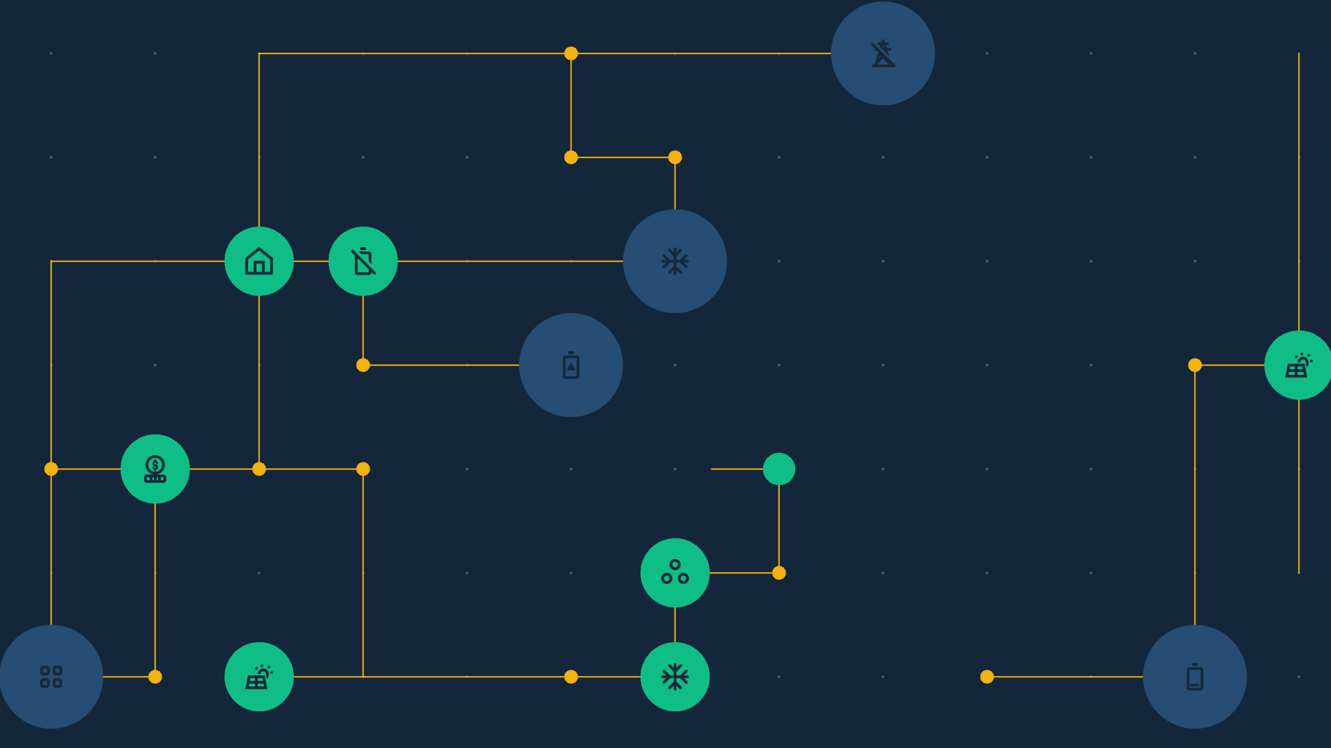
My breakthrough was to focus on the connections instead of the nodes. I imagined the connecting wires as being a trail laid by a creature that navigated the grid. Every time the creature reached the junction between grid co-ordinates, it had a chance to lay a node, and to change direction.
This proved much more promising; the first draft immediately started to demonstrate the kind of behaviour we were hoping for. The creatures roamed the network, passing one another, laying nodes, connections springing to life. This sketch - called walkers - became the basis of the project, and I continued to build upon it right to the end. In my head, I couldn’t help but imagine the invisible creatures as much like the 3D-printing tardigrade robots in Bungie’s Marathon concept trailer:
Finding the right metaphor was invaluable. Thinking of the walkers as creatures made it much easier to reason about their logic. They had a little state-machine brain, a finite lifespan, and we would add new rules to their logic as necessary; shades of the Pac-Man ghosts (a favourite demonstration of just how little “AI” you need for recognisably lifelike behaviour). Every time there was an issue with their behaviour, we added another rule to the Walker class.
I ensured the README.md for the project contained a plain-language description of their AI:
- A walker initially begins at a random corner
- A big blue node spawns there
- It chooses a random DIRECTION to move in
- It picks the target square one unit in that direction
- If that target square is not off the grid, it moves to it
- It then picks a random direction that isn't the way it came.
- If that direction is a change of direction, it spawns a new node
- If the previous node was big, the next one is definitely small.
- Otherwise, the next node is probably small, but it might be mid or big.
- When scroll is enabled, after about 25% of the screen has scrolled, two new walkers spawn in.
Incidentally: a lot of the work here, both in terms of implementation of dynamic animation, and modelling its components as creature-like object, stems from my work teaching Sound and Image Processing at CCI. Time spent playing in ‘creative coding’ tools, thinking about creature behaviour, and working in frame animation, all paid off into this client project. It’s also a nice reminder that p5.js is a great fit for projects beyond educational or toy applications!
Iterating as a team
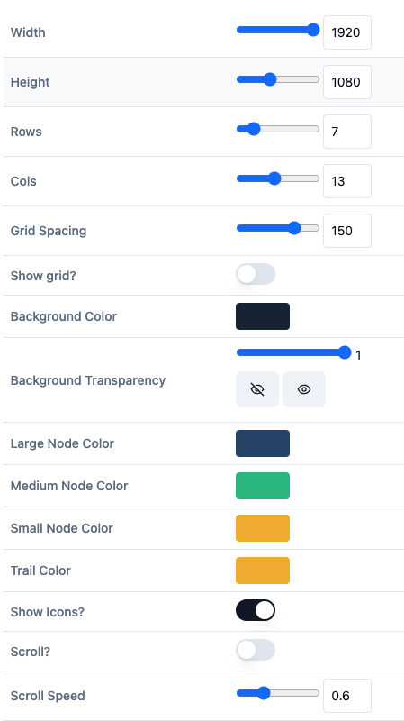
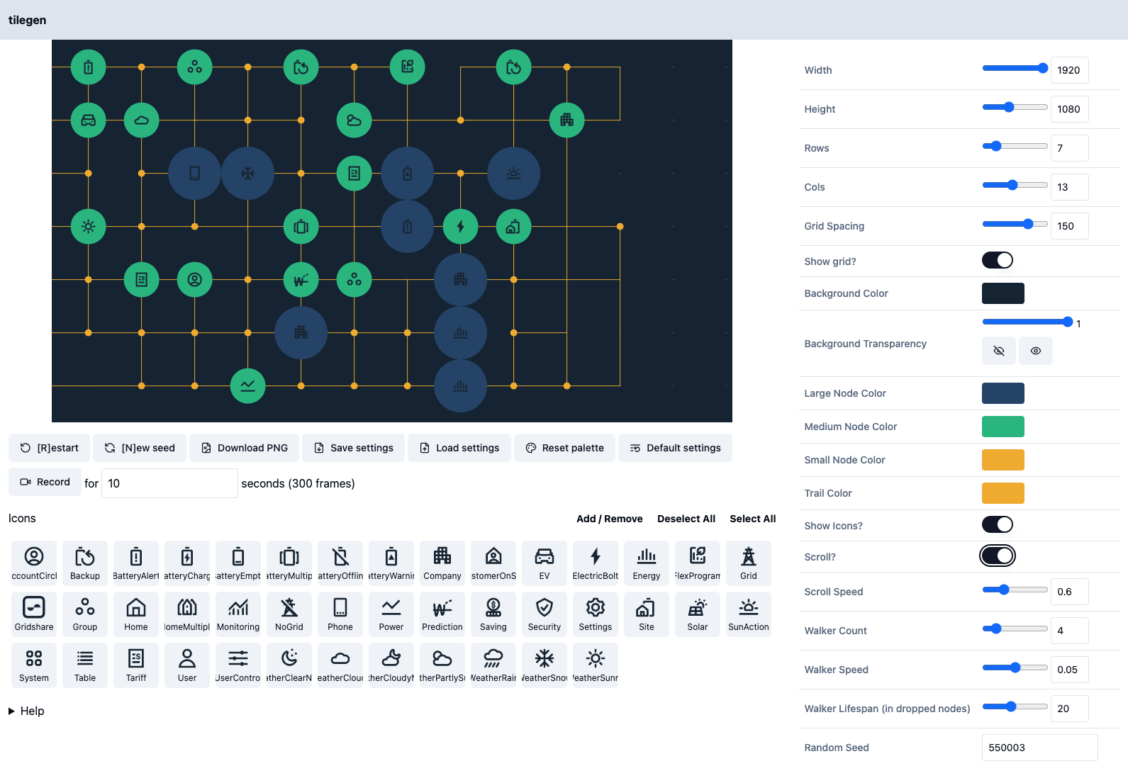
At this point, I deployed the walkers demo as a static site, and started iterating with the design team. A lot of the work now was around parametrising the tool: adding simple options for changing the colour scheme, resetting the random seed, changing the grid size or resolution (for, say, portrait videos), and so forth.
Because p5 renders to a <canvas> element, we could export the canvas contents as a PNG file. I added two export buttons - one for the current frame as a PNG, and one that’d recorded a set number of frames and offer up a zipfile of PNGs for download. (All compressed entirely inside the browser, too! Browsers continue to be cool).
(This led us to our first little scope pivot: we confirmed that most video tools these days will happily import a sequence of PNG files, with no other work required. So we no longer needed to mess around with ffmpeg, either on a server, local computer, or through some kind of WASM wrapper. That freed up development time: I could just focus on “getting to PNGs”, and the design or video teams would be happy with that output.)
Finally, it was important that colleagues could share settings they liked with each other, so I made it possible to export the data, including the p5 random seed that led to the particular outcomes.
I’d push out updates, let the team play with it, and they’d drop suggestions into Slack. One request was to add the Gridshare brand icons to the nodes. I came up with a UI that would let designers select which icons were in play - for instance, they could select icons related solely related to electric vehicles if they were bookending a video around EVs.
What if the icons changed, or designers had new icons to add? I was keen that this tool was usable without me - as a consultant, I was going to walk away from this. So it needed to be standalone and extensible. The solution we came up with was letting users add their own icons to the app, uploading them to localStorage as base64 encoding. They could then use additional icons - it was limited to saving them to their local machine, but it would be persistent, and that was good enough for our needs.
Whilst I worked on the tool, Lunar Design started playing with it. This was where the project really came to life: James would share videos to Slack, dropping the stings he’d generated into the background of greenscreened talking heads, or as translucent layers into other intros, exploring the range of ways our animations could be used. Sharing our demos with each other had two immediate effects: firstly, motivating and exciting us as a team, and secondly, giving us new ideas for tweaks and features.
Meanwhile, the designers also started seeing where this look and feel would take them. There were some great mockups of how the concept could be applied to print media and other design materials. The design team were the target audience for the tool, and it was great to watch them play with, push it, and then use its creations in all manner of other concepts.
Soon, we had a complete-enough feature set, and my small budget was up; I handed the tool over, and left them to work with it.
The after-life of tools
What I love about this project is that there’s still more to say. Tools aren’t just transactional - “push button / get bacon”; a good tool can be playful, inspirational, a thing to learn and master. And it’s clear that the growing-grid had really landed as an idea, and the design team were exploring all the ways they could use its outputs.
Some weeks after it shipped, Matt caught up with me. As he says in his writeup:
Even the early prototype was enough to set bells ringing - this is bigger than backgrounds for video, this was something really great.
This should be the new brand identity of Gridshare…
James quickly did a build out of a minimal set of brand identity rules based on Tom’s work, not forgetting examples based on the original brief from Bobby for video backgrounds!
A few days later we pitched it to Lunar’s leadership and got agreement to push forward with it, starting by using the finished generator to make the assets for the gridshare page refresh…
The new website recently launched, and sure enough, the grid is everywhere: bookending interviews, front-and-center in that hero animation.
That hero animation is a great combination of work. The growing animation is our Javascript tool, its zipfile of PNGs converted to video - but the zooms that crash into a node, revealing relevant video inside, are pure After Effects work, the designers using our output as the source for another idea.
To be grand for a second - our little project had become the foundation of a generative brand identity. The tool could be customised and extended by end-users, with new colours, icons, parameters, as they needed - and that’s before you consider they also had the source code for it. And all from a single page of client-side browser code!
What made the project work?
It’d be easy to conclude this by saying “and the reason for all this is that Tom’s really good at Javascript and dealing with uncertainty!“. And that wouldn’t at all be true.
The reason it worked is because of the team as a whole:
- we had a strong brief that was held loosely.
- we were all happy to let the grain of the project and its materials direct us: if other possible directions emerged, they were probably worth following!
- we worked in a high-trust environment - the designers were happy to let me riff and explore, but I gave them working code regularly and swiftly, and loved seeing what they came up with.
- we had an asynchronous, high-communication project channel. Got an idea, got a screengrab, got a new demo? Stick it in the channel. This worked because it was a small, collaborative team, but we shared screengrabs and videos swiftly and fluidly, and everybody’s feedback contributed well.
- Everybody used the tool as soon as they could. I deployed frequently, and the designers really took to it. I fixed bugs as a priority, because I wanted them to use the tool as soon as possible; if software is “mainly broken”, it mainly goes unused. The results of this really paid off.
I love toolmaking. Not because I like building user interfaces and parametrising work; I love toolmaking because I like seeing what other people do with those tools. They’re a kind of force multiplier: more other people can play with an idea, and have their own ideas with it.
I wasn’t expecting that to happen to the level it did here, but it’s such a great demonstration of the value of wrapping creative code in the simplest usable UI you can think of; turning scripts into tools. So much of the actual output of the project ended up manifesting long after I’d left it; I’d left my ideas and work baked into the tool, and James, Paulina, and Matt put it to better use than I could have hoped.